Other projects ———
Boosting productivity with assisted coordination
Prioritising key actions for better usability
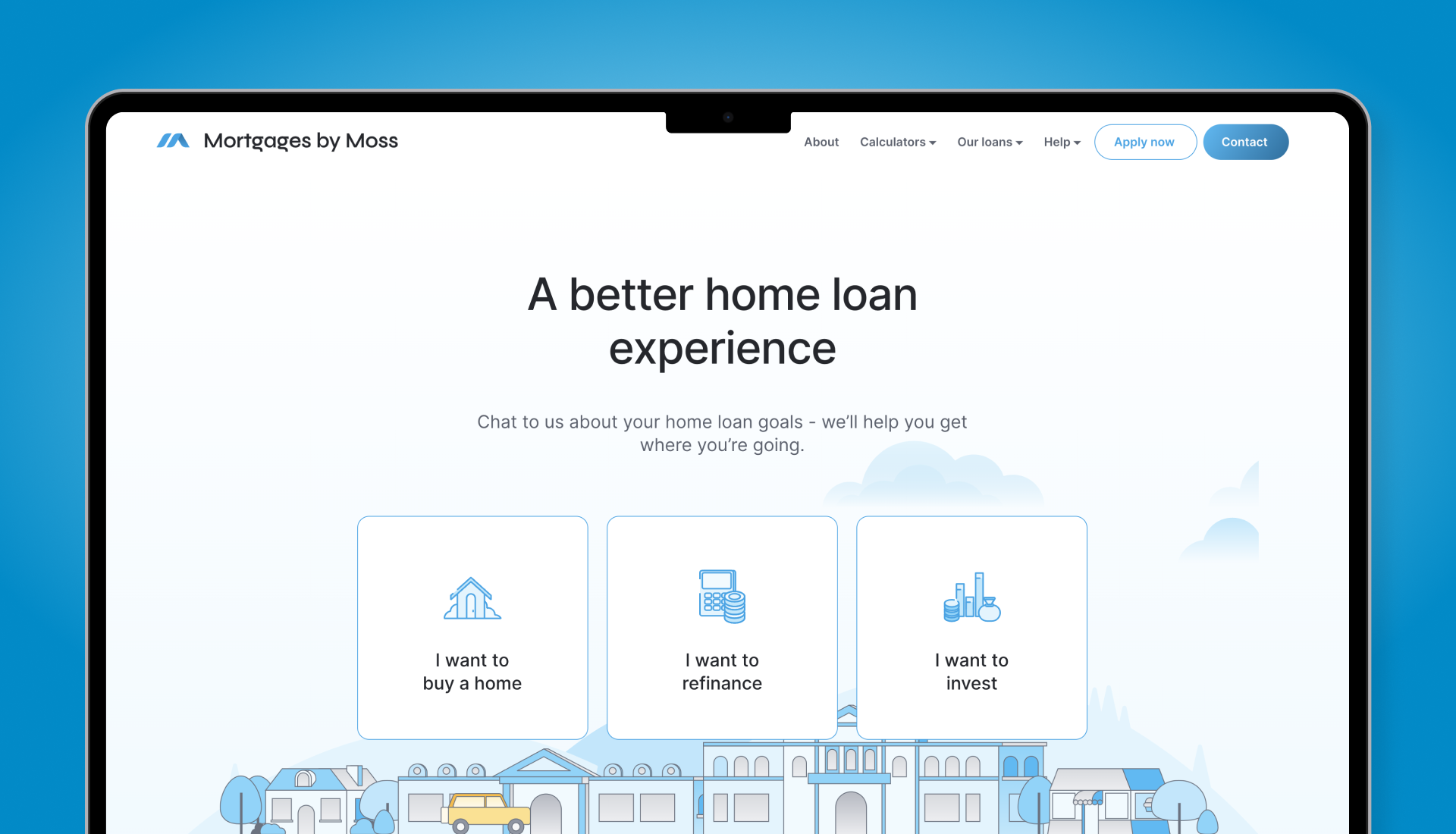
When it comes to financial services, it's important for people to have meaningful, positive interactions with their lending advisor to build trust. Mortgages by Moss wanted to stand out and boost lead generation by improving the user experience on their web and mobile touchpoints.


The existing state of the website had multiple usability issues and poor user engagement:
I completed a heuristic evaluation of the existing website to identify key issues so I could create a smoother, more engaging experience that captured users' attention.

A more intuitive flow was needed to make information easily accessible, from simplifying the user interface to streamlining navigation, ensuring the entire journey — from landing on the website to connecting with a lending advisor — felt effortless.
To find out what competitors were doing in this space, I began with market research and learned about best practices. Many featured mortgage calculators and had intuitive navigation pathways that made it easy for visitors to find key information, making the overall experience feel approachable.
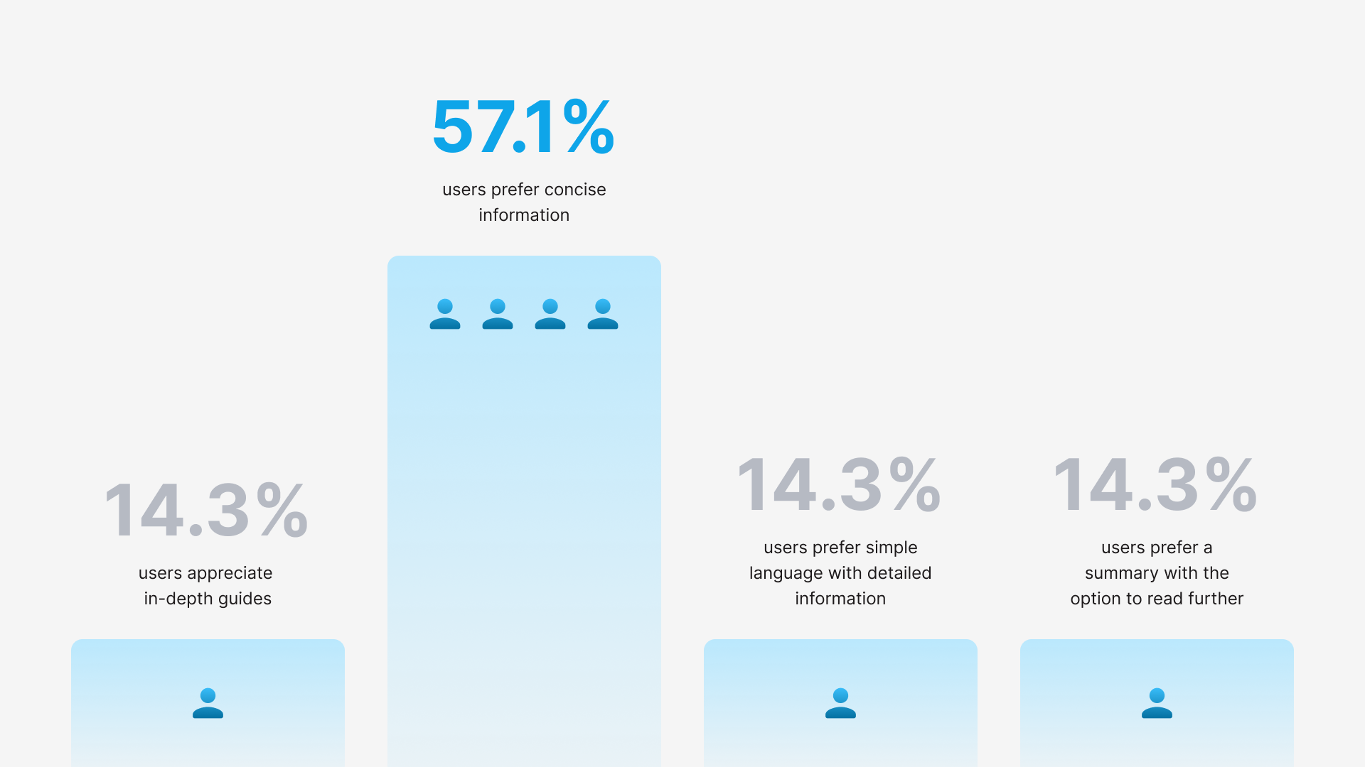
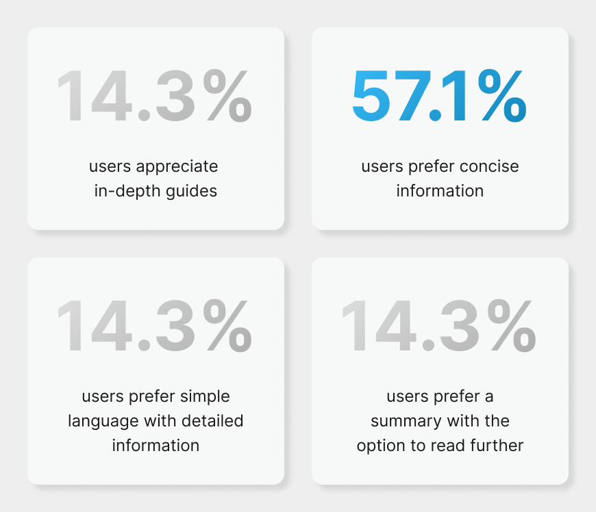
To challenge assumptions about what potential clients valued when using mortgage broker websites, I surveyed and interviewed a number of users. I found that they not only wanted ease of navigation but also more transparency in the process, expressing frustration with overly complex information and hidden fees.
“I don’t want to have to doom scroll for key info.”
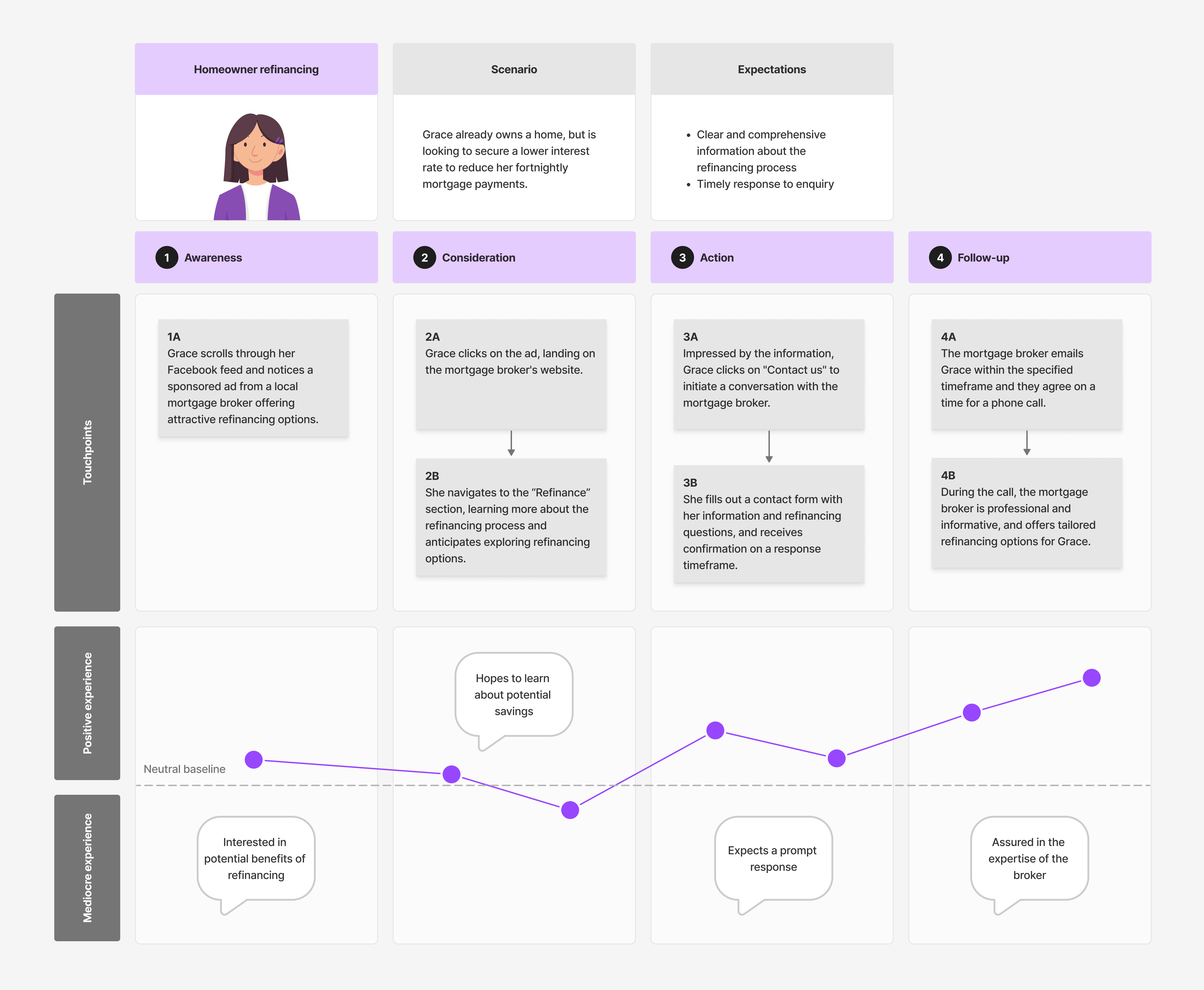
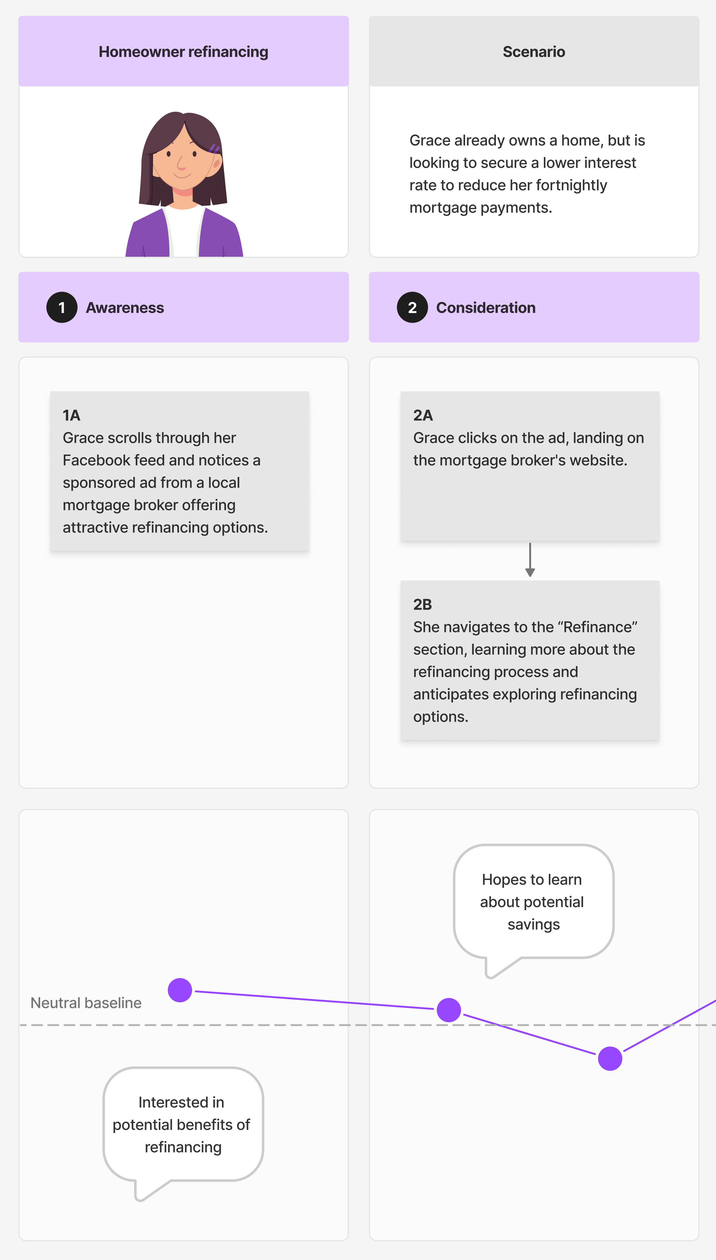
— Homeowner refinancing
When synthesising the research, three key personas emerged - a first-time homebuyer, a homeowner refinancing and an investor. I mapped each user journey against touchpoints to pinpoint where they faced challenges, experienced confusion or became disengaged, to ensure that every interaction could be optimised to meet user expectations.
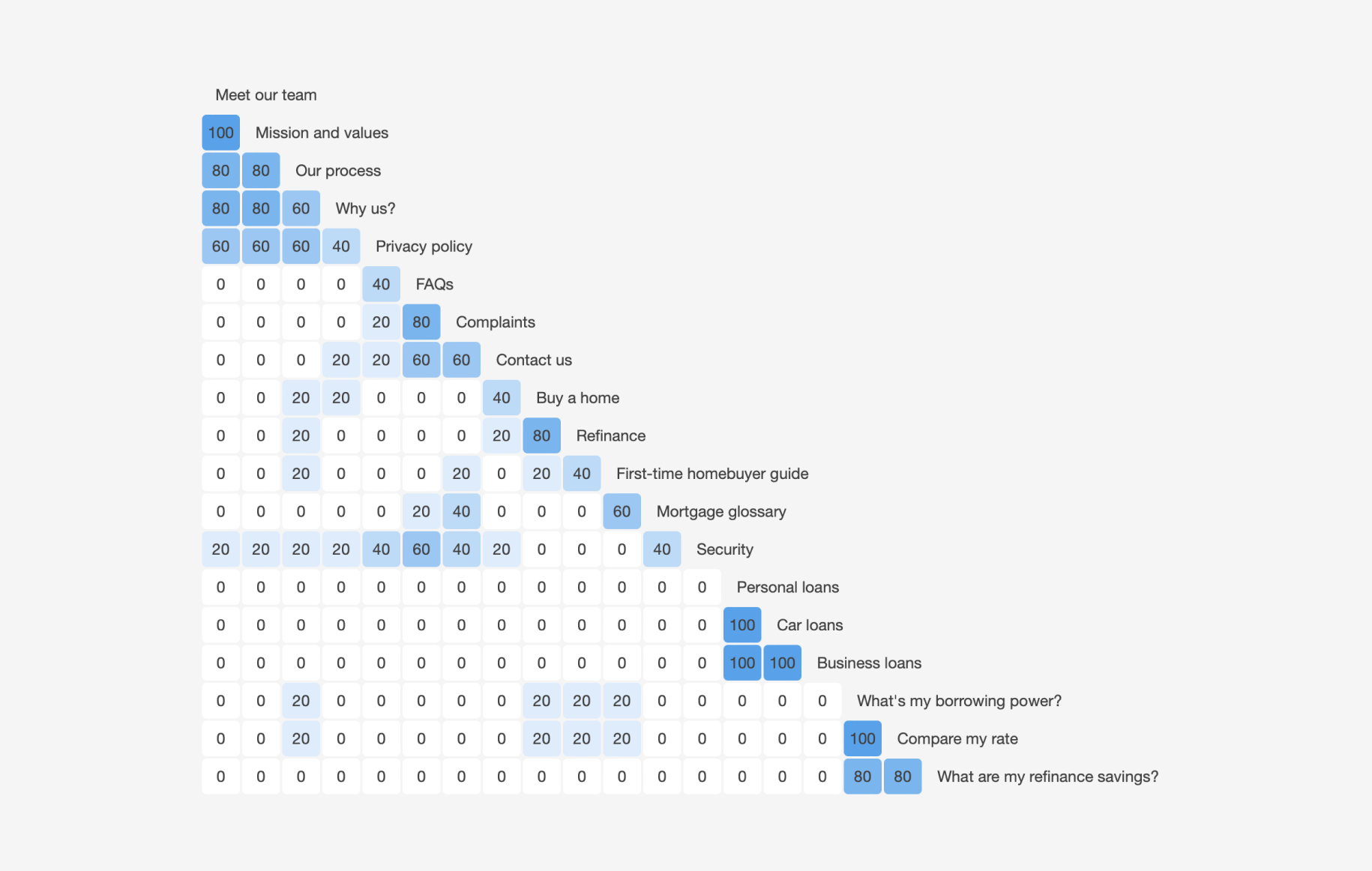
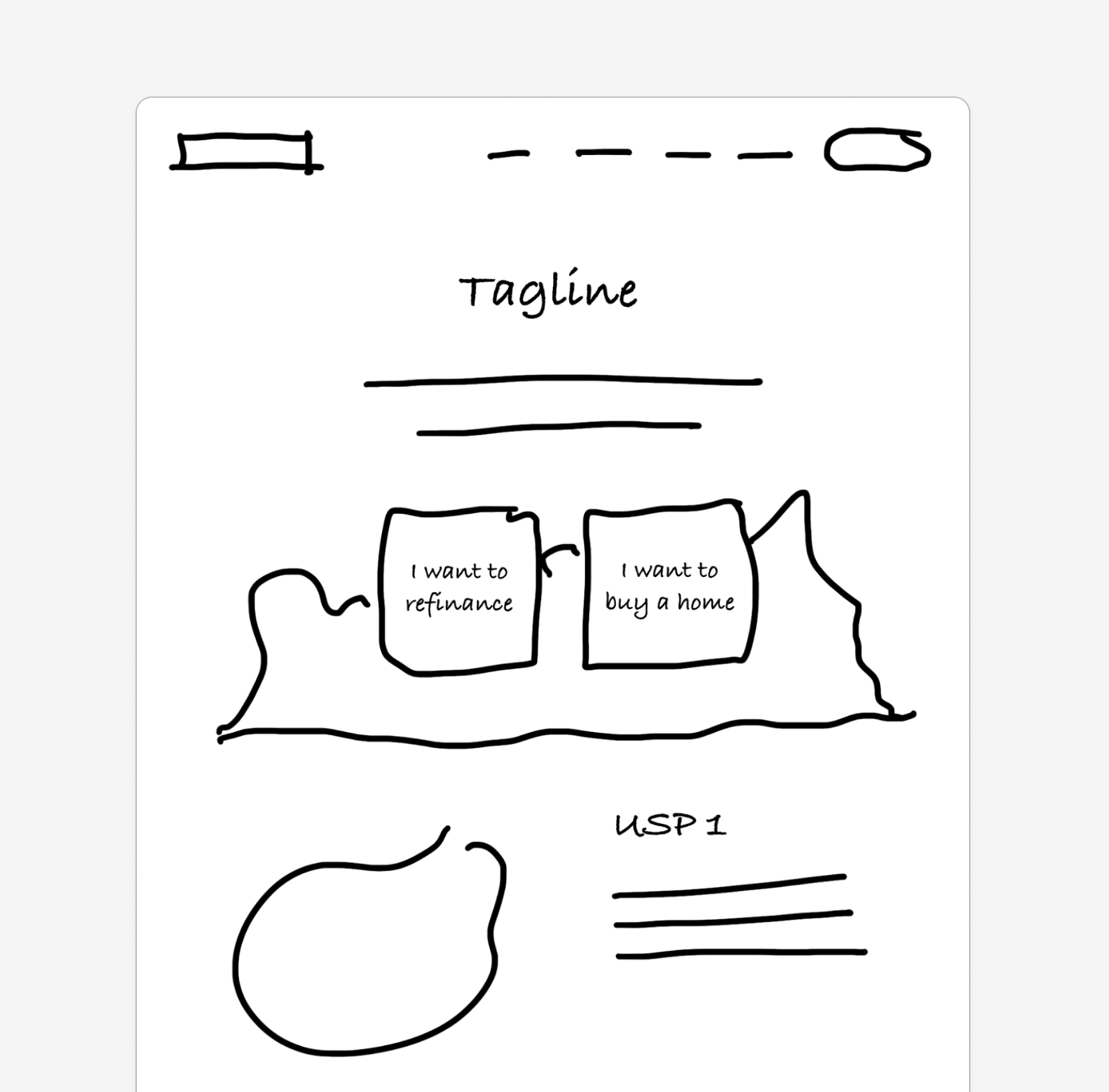
With a large amount of information to structure, I turned to a card sorting exercise to categorise user expectations and mental models, which helped inform a content strategy. This became the foundation for the site map, defining a scalable hierarchy that organised information logically and intuitively.
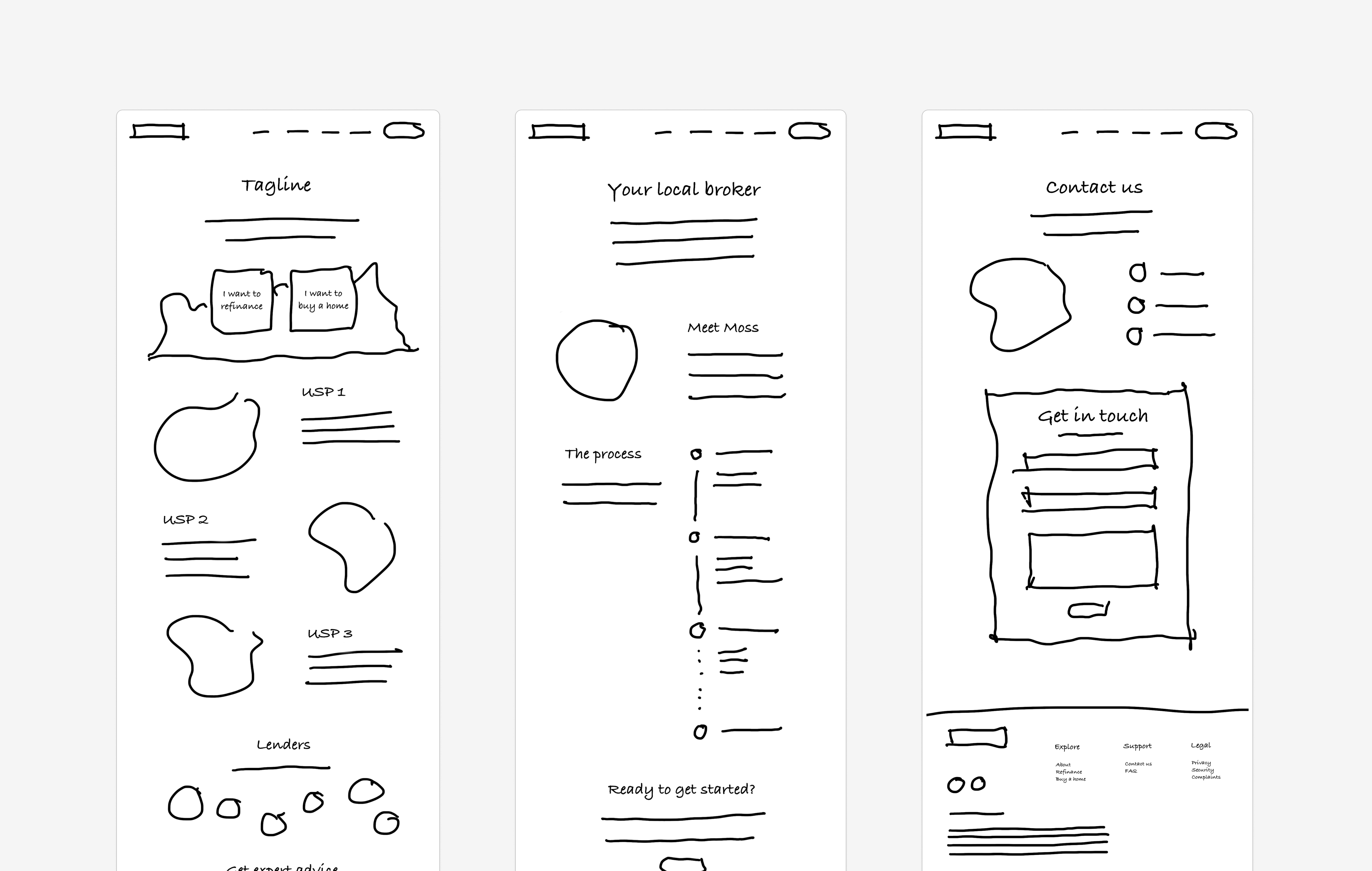
With the information architecture in place, I began roughing out ideas for navigation structures, page layouts, and content placement. This allowed me to explore different approaches to making the content more accessible, while also experimenting with the interactivity of the interface.
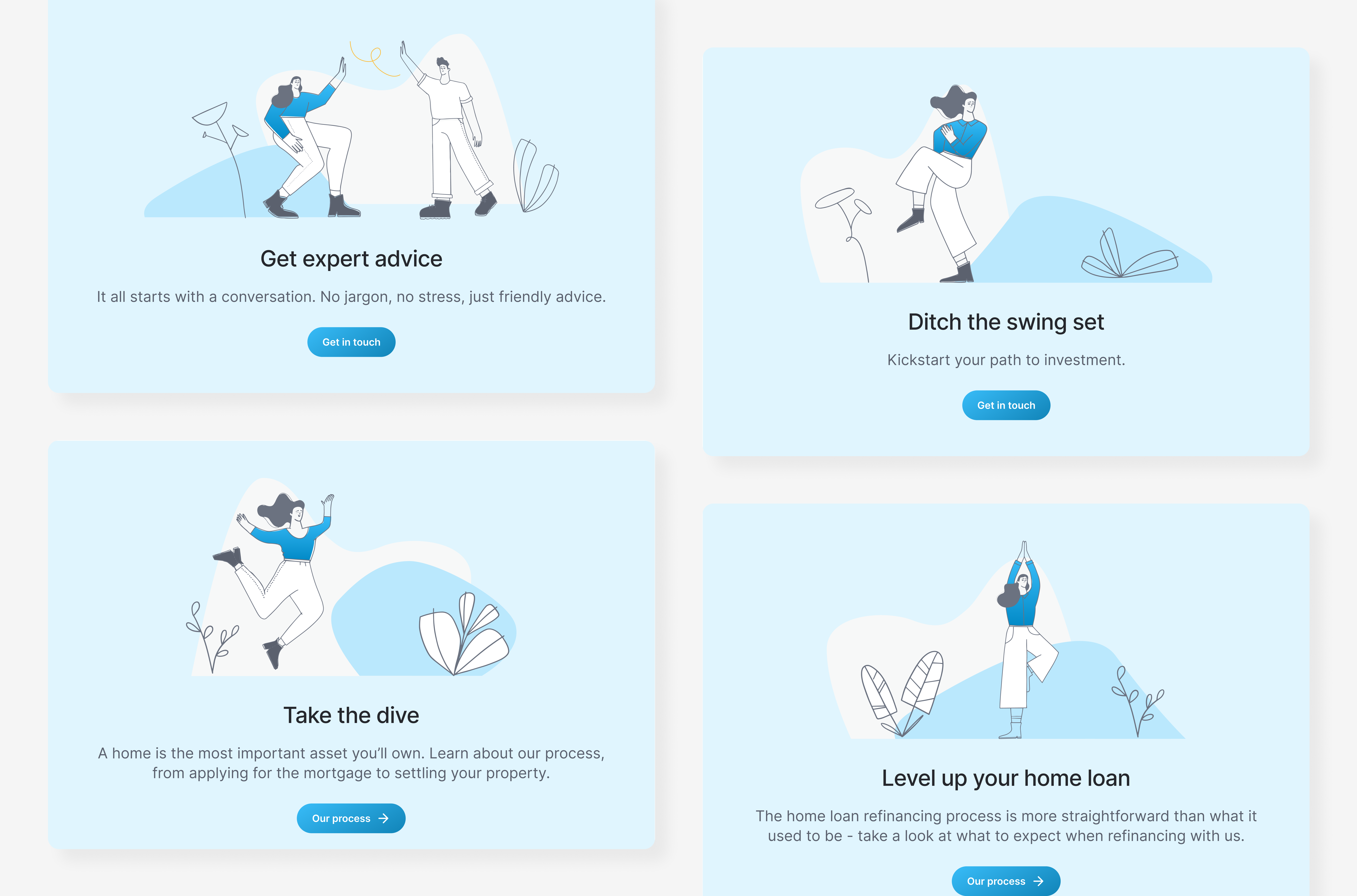
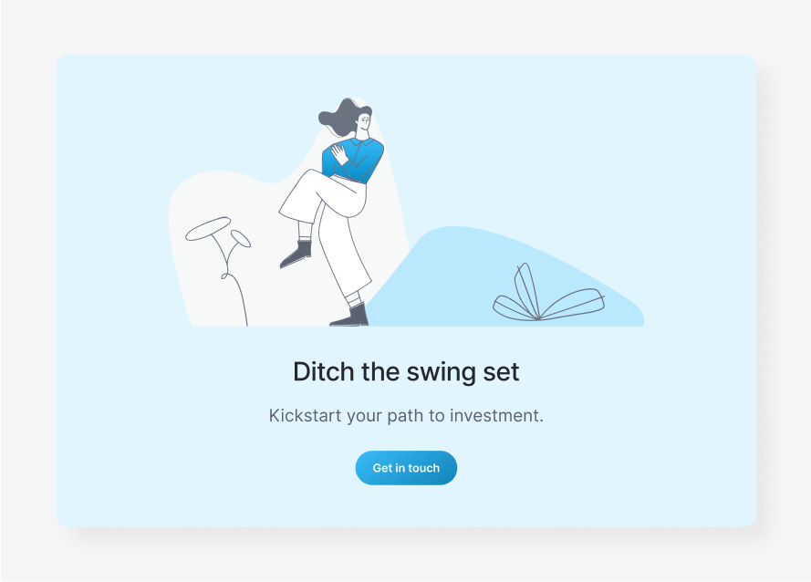
Consistent and relatable copy was used throughout the redesign to keep the messaging clear. Casual language left room for ideas, providing users control over their journey so they could interact with different elements on their own rather than being restricted by rigid instructions.
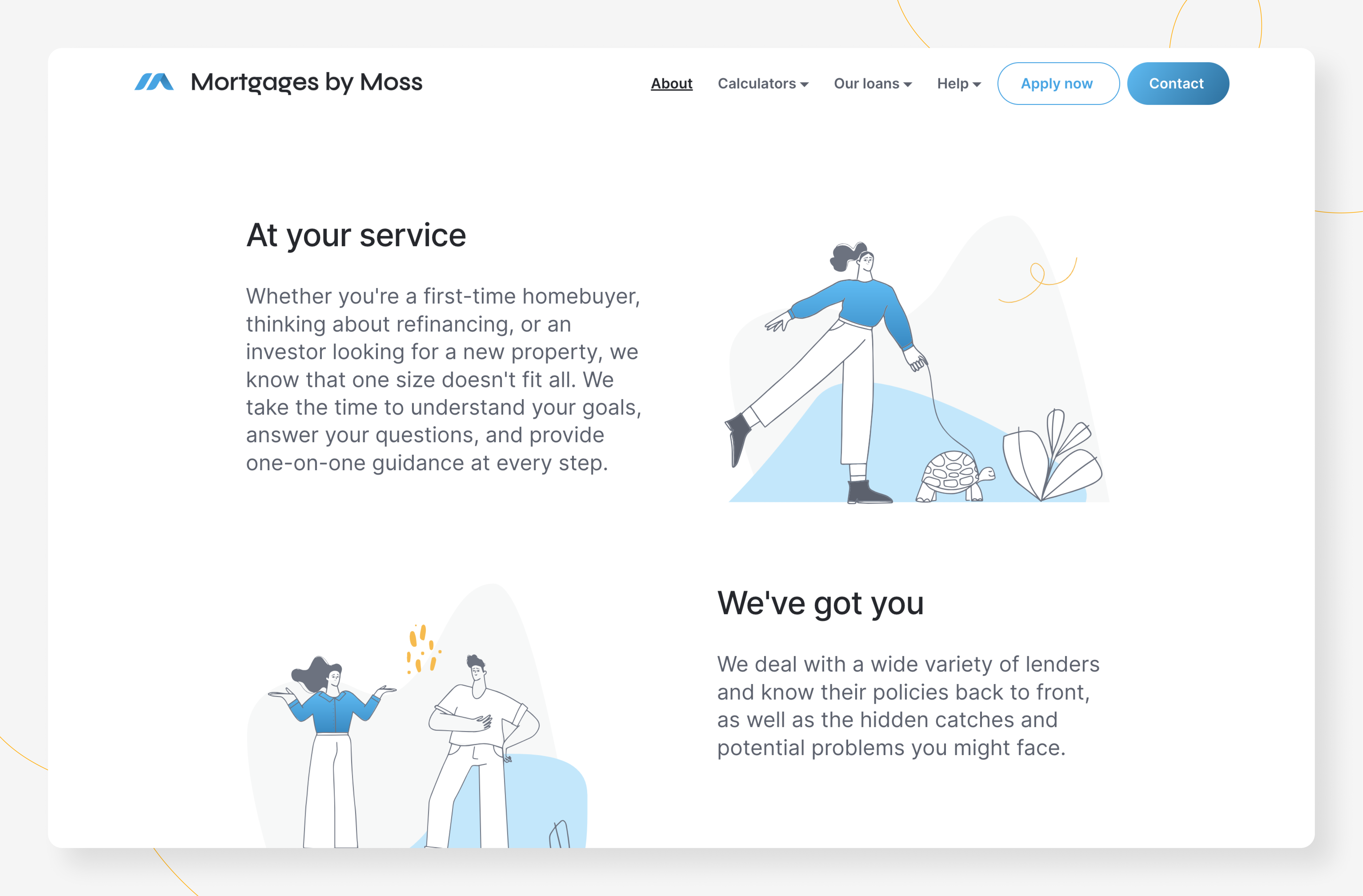
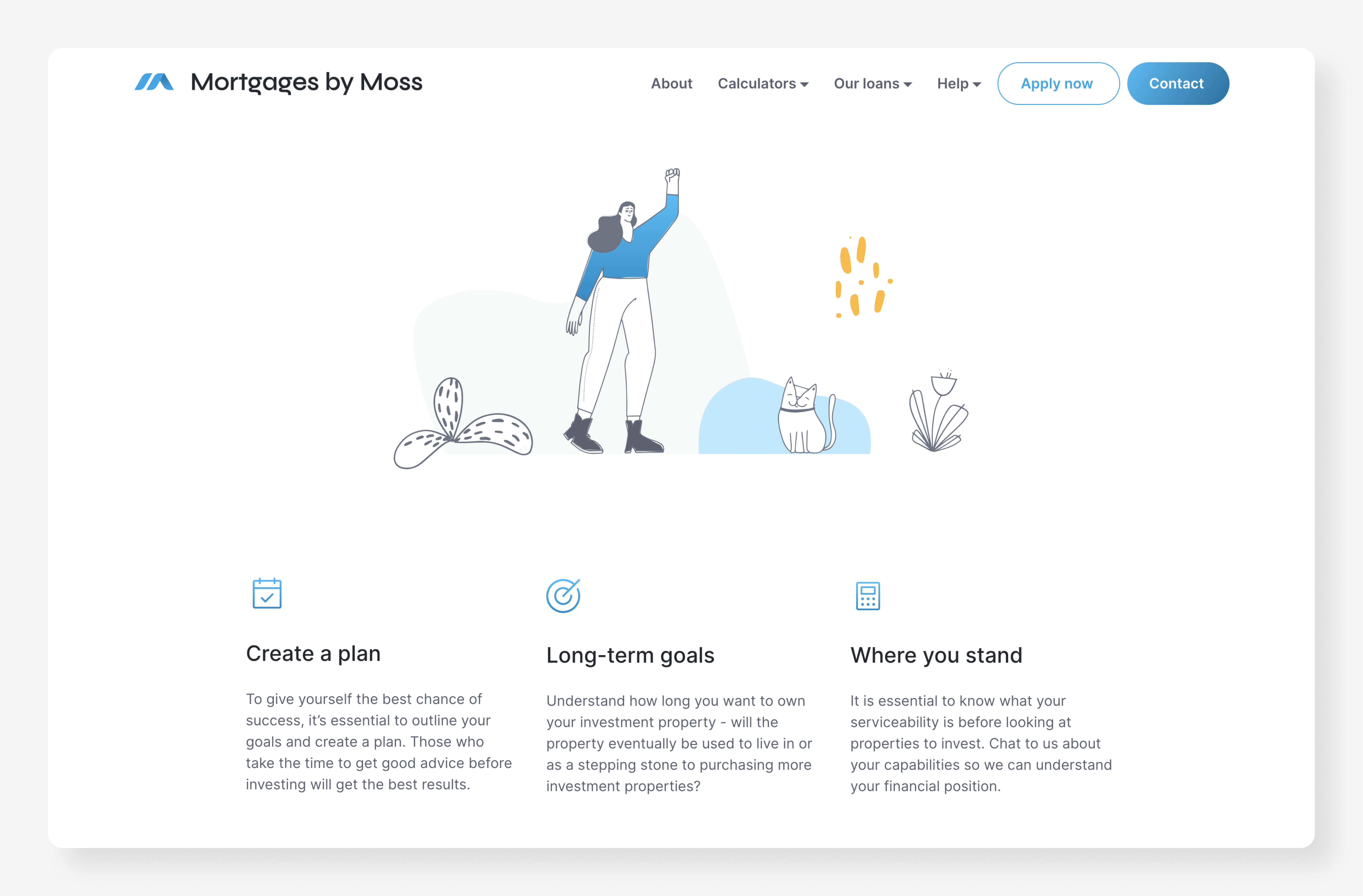
Visual aids such as recognisable icons were incorporated to break complex information down into bite-sized pieces. I opted for left-aligned text to enhance readability, allowing the content to be easily comprehended so information could be processed quickly with minimal effort.
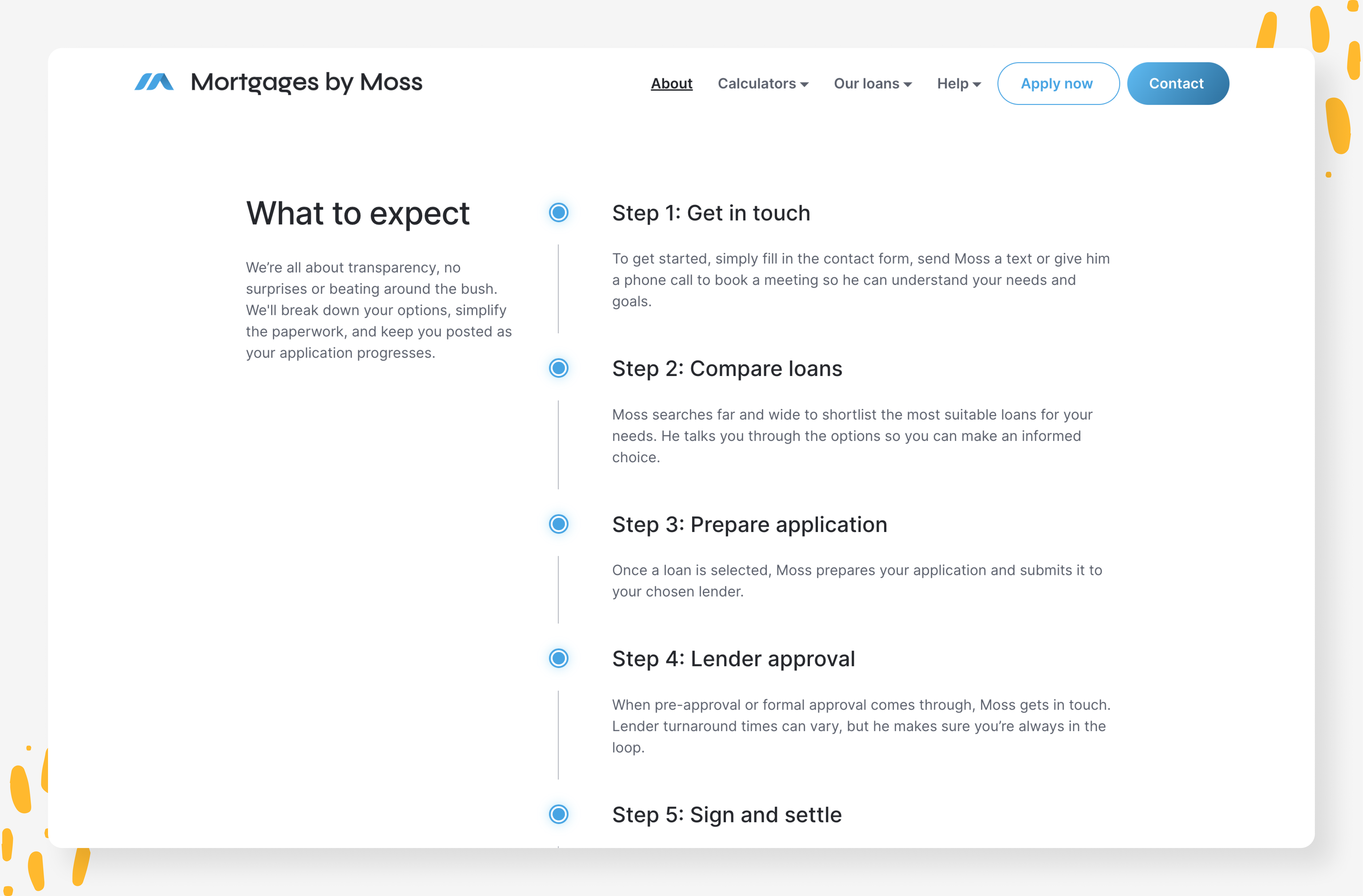
A common pain point when working with mortgage brokers was the lack of clarity around the application process, leaving people unsure about what to expect. To address this, I introduced a step-by-step walkthrough of the expected process accompanied by visual indicators, so users were kept progressively informed as they read about each stage.
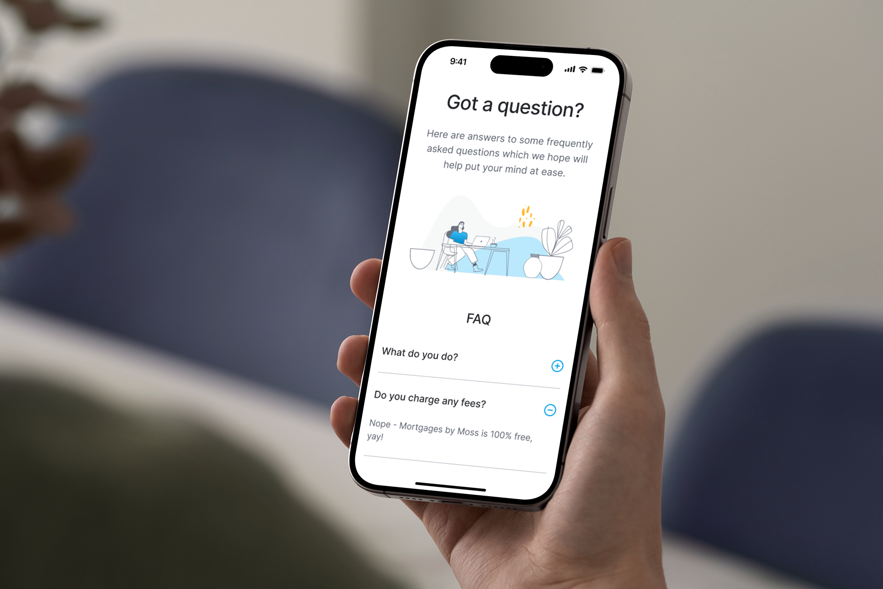
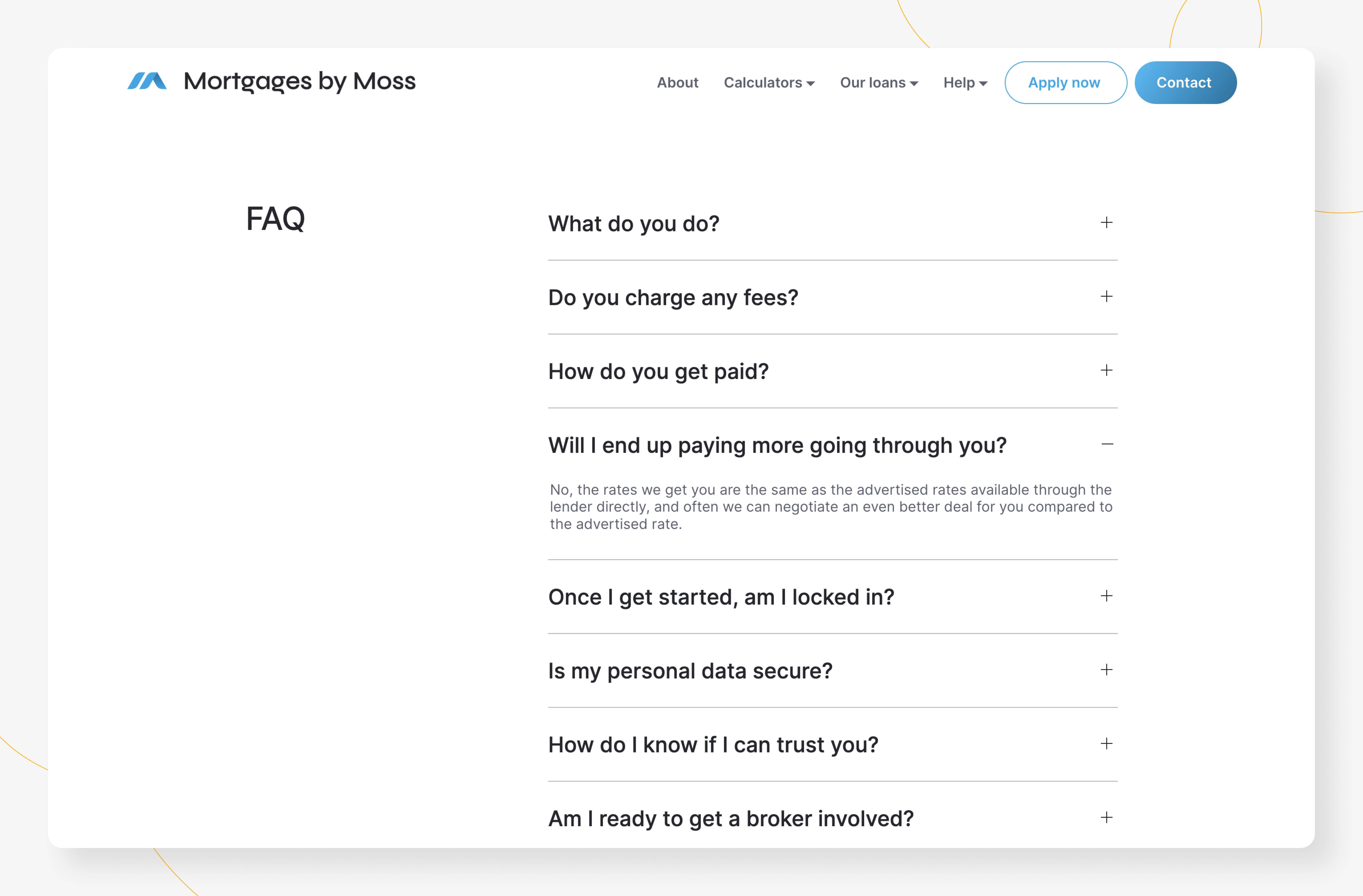
To give users more control over the content they interacted with, an accordion design was implemented for frequently asked questions. This allowed for high-level scanning while letting users choose the details they wanted to see, without overwhelming them with lengthy text or excessive scrolling.
By maintaining consistency in the style and placement of call-to-action elements, actions became easily recognisable across pages. This reinforced the brand’s identity, helping to create a cohesive and professional experience. As a result, users were more likely to engage with key actions, such as getting in touch or exploring further, ultimately driving conversions.
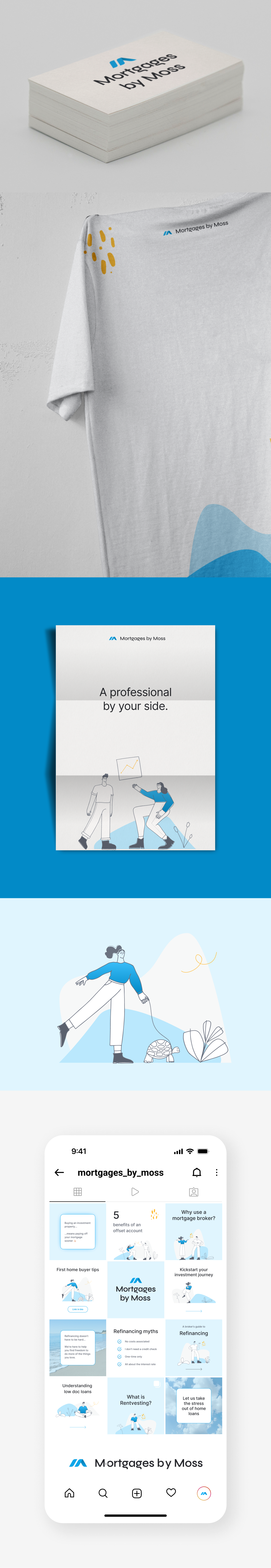
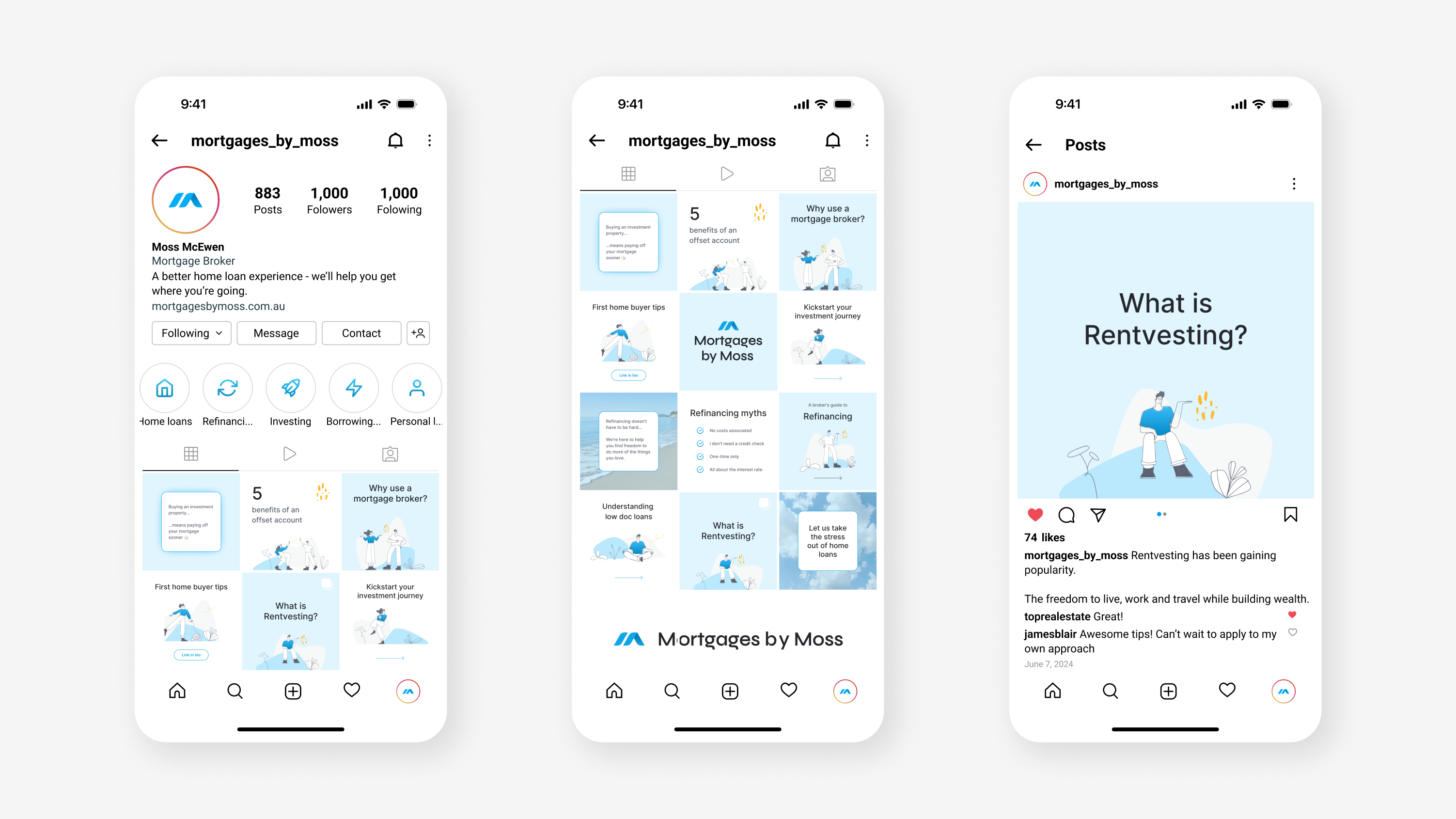
To increase brand awareness, I was also tasked with creating a new visual identity and social media templates. My goal was to create an identity that told the story of Mortgages by Moss’ approach to his craft, his relatable nature, and his expert skill sets.

With a limited budget, I didn’t have access to web developers - the website was built using a no-code builder, which also enabled the client to manage the site independently post-launch. With a focus on establishing trust and transparency, the new website enhanced usability and provided a better experience for users exploring mortgage options. Within three months of launch, there was a 78% increase in users and a 204% rise in engaged sessions, marking a significant improvement in overall performance and user satisfaction.