Other projects ———
Boosting productivity with assisted coordination
Qualifying leads for a service-oriented business
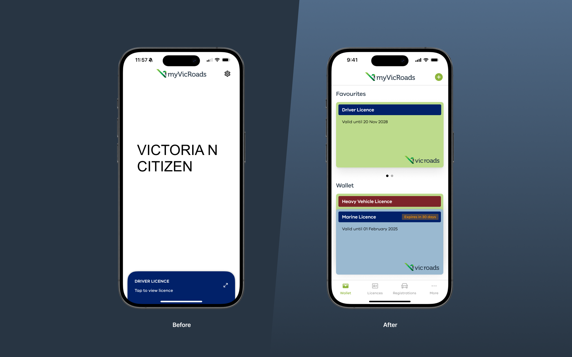
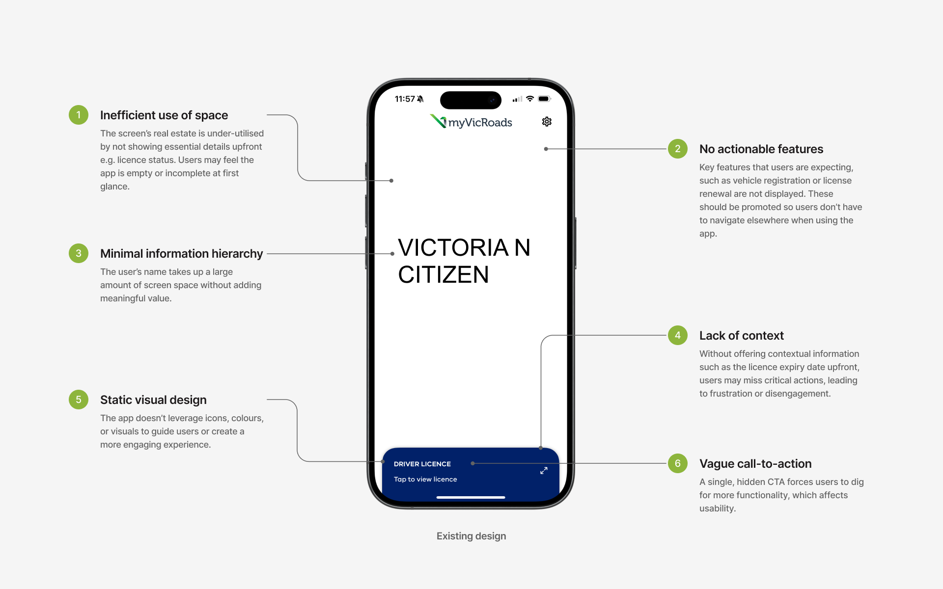
The current VicRoads app home screen lacks a clear hierarchy and doesn’t prioritise key user tasks, such as licence renewal or vehicle registration. Essential information, like expiry dates is not prominently displayed, while a significant portion of the screen is occupied by non-actionable elements, creating an under-utilised interface.
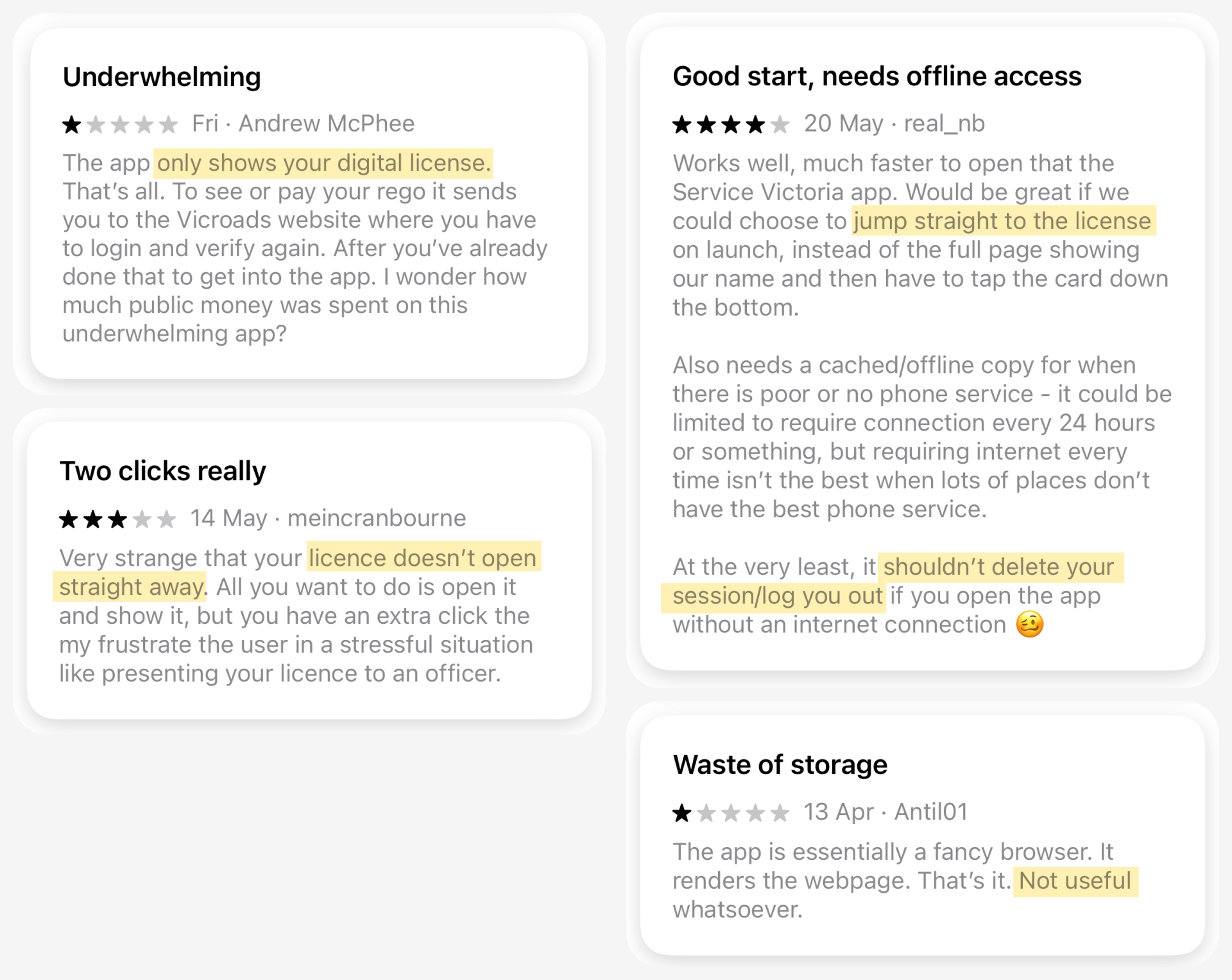
To validate these concerns, I had a look at some recent reviews from the Apple App Store. I discovered common themes and pain points, such as the app not showing the user’s licence by default, frustrations with sessions not being retained, and a lack of useful features.

Through detailed analysis, I identified usability issues such as lack of feature prioritisation, unclear navigation and inefficient layout.

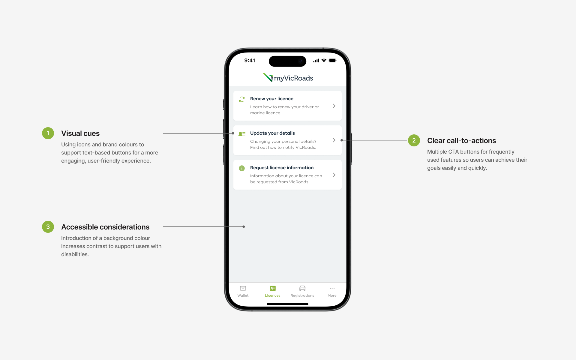
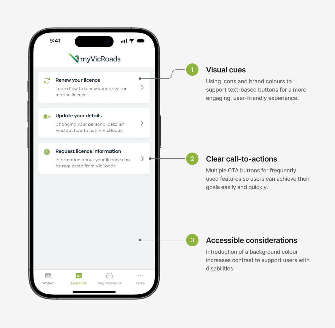
My redesign focused on streamlining the user flow, improving navigation and making features more discoverable while incorporating accessibility best practices. By improving visual hierarchy and surfacing key actions, I created a more intuitive interface that increased usability and addressed user pain points.
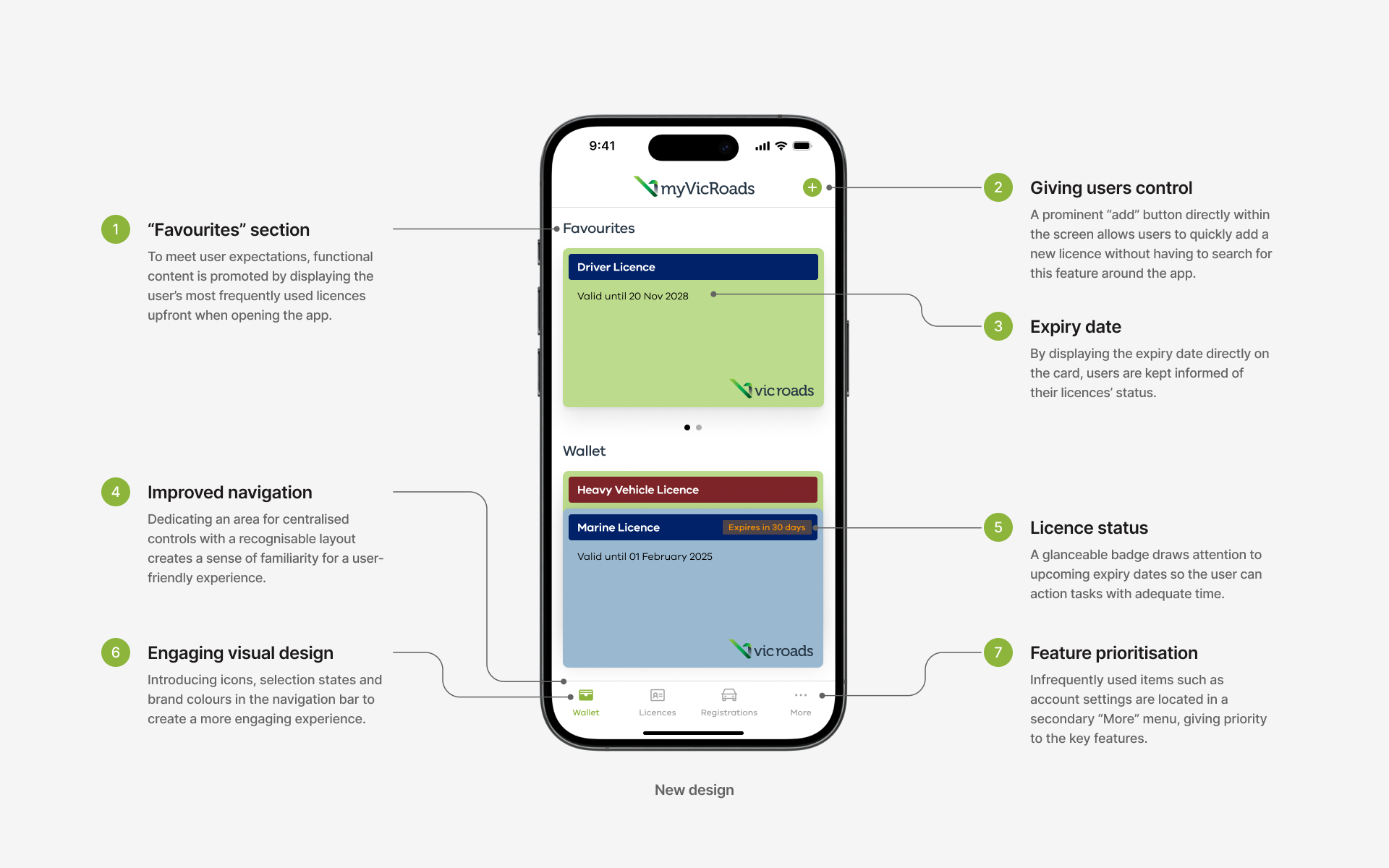

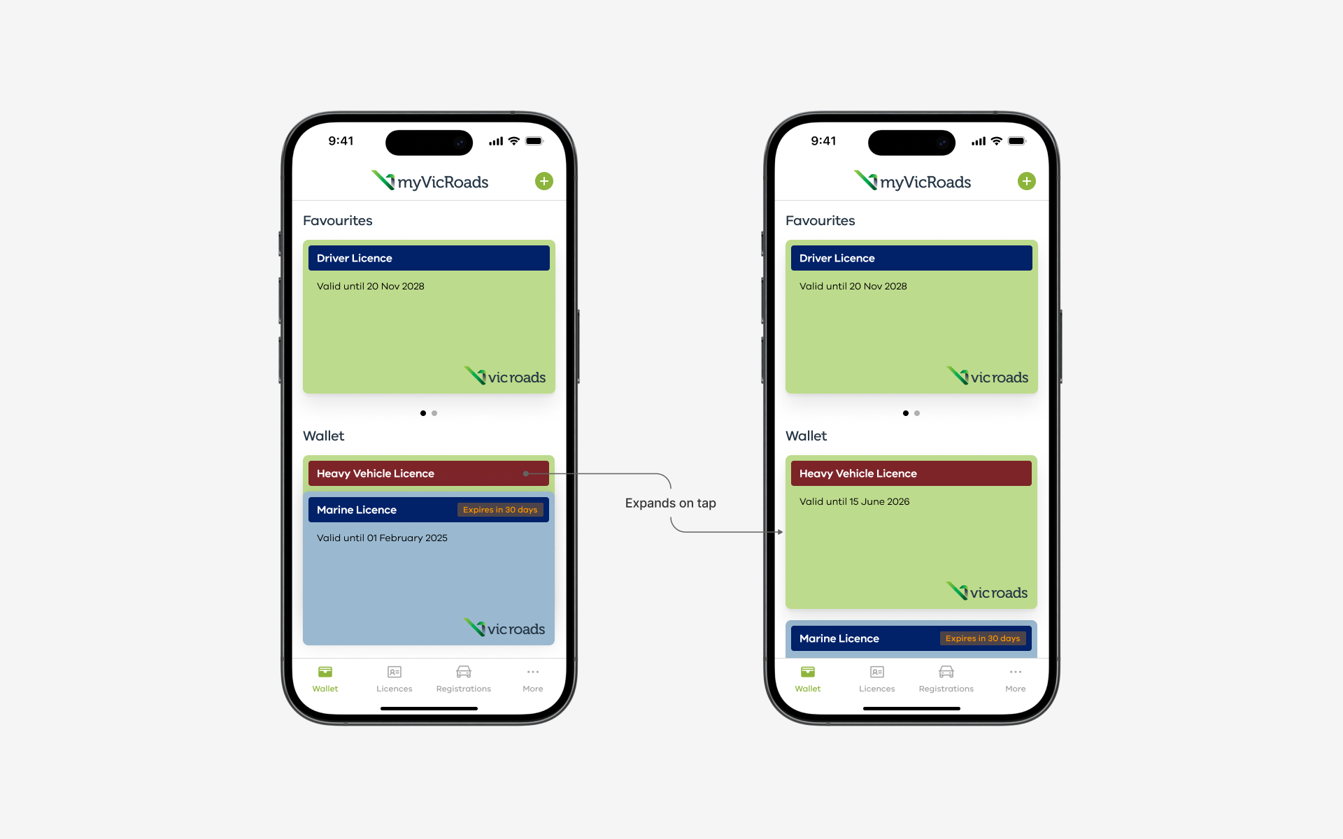
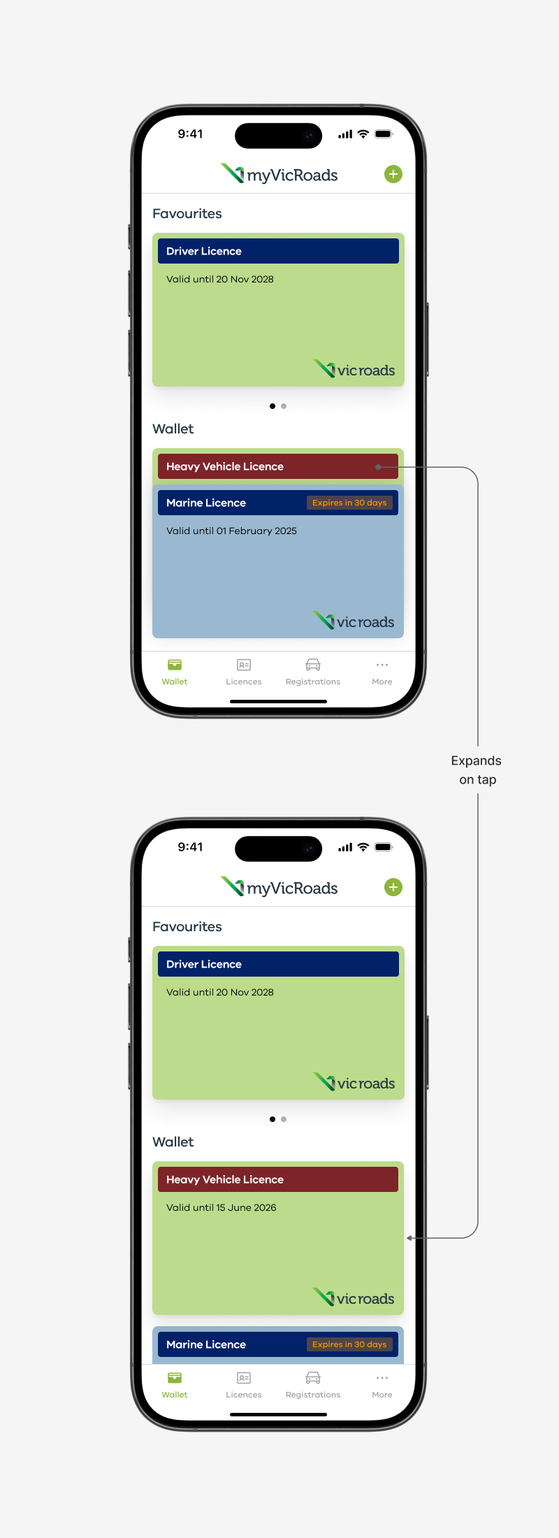
A ‘tap to expand’ feature was incorporated to make the experience more engaging, showing a preview before entering into a separate screen to see full licence details. Future iterations of this design could explore ways to reveal full licence details directly on the preview, for better efficiency and less cognitive load.
One of the major pain points was the perceived usefulness of the app, due to its features being hidden. To address this, essential features were prioritised on the navigation bar to make them discoverable, with actionable CTAs directly accessible from each feature.
This personal project allowed me to evaluate the existing design critically, address user frustrations, and create a practical and visually appealing solution based on UX best practices. With more time, incorporating features such as allowing licence numbers to be copied could further elevate the experience for VicRoads’ diverse user base.