Other projects ———
Boosting productivity with assisted coordination
Prioritising key actions for better usability
Architectural services can encompass a wide range of activities, from design concepts to project management. For many people, understanding the process requires sifting through large amounts of information, which can be overwhelming and confusing. Making Ground recognised this as a blocker to engagement that needed to be addressed in order to position themselves as a trustworthy and client-focused business.
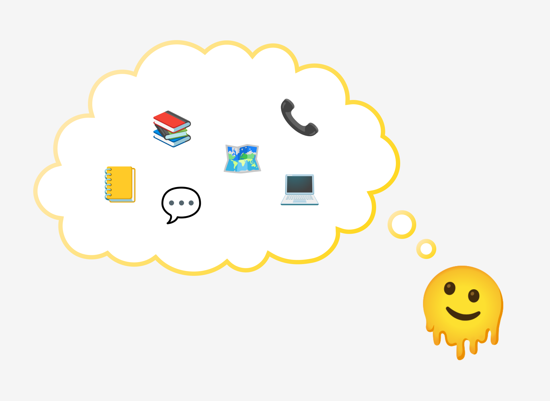

Information about the services offered by Making Ground was available on the existing website, however people were still reaching out to ask about these details. This suggested that the way information was communicated may not have resonated with the users.
My challenge was to refine the user experience so potential clients could easily find and understand the details they needed, while also alleviating the pain points they encountered when researching architects.
Snippet of the existing website for context:
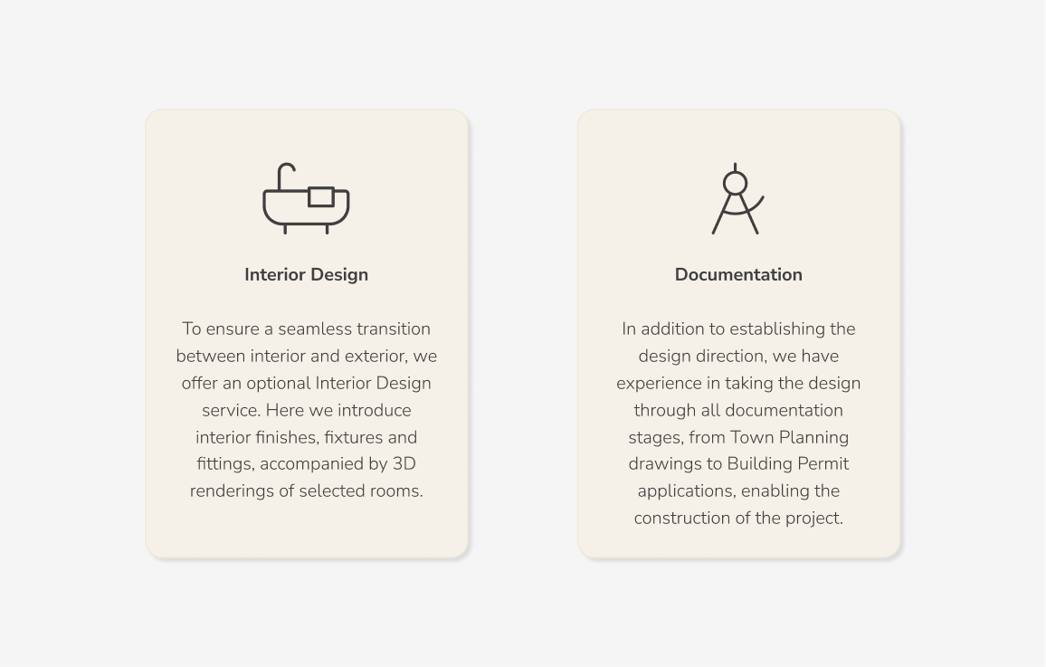
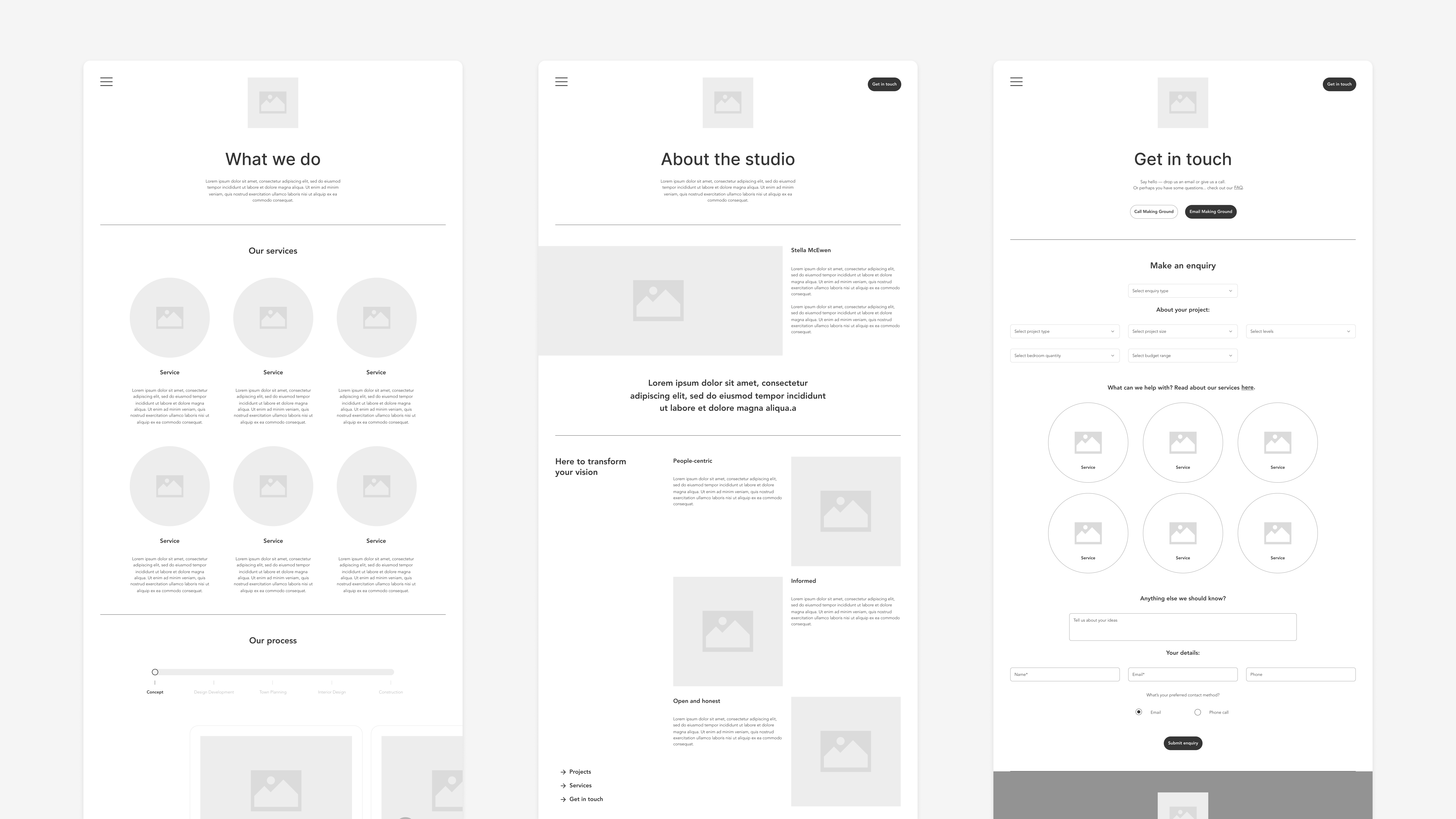
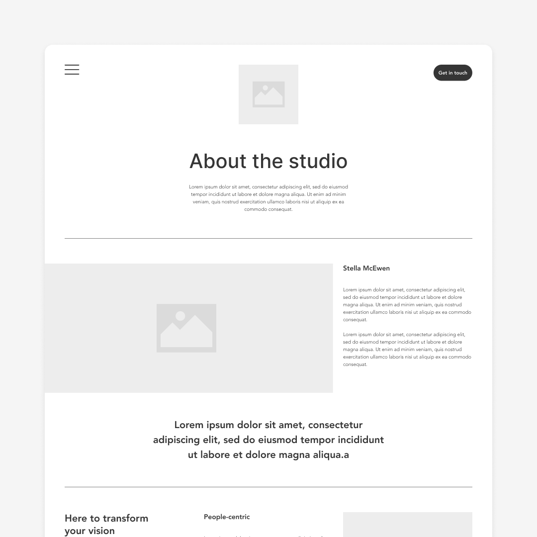
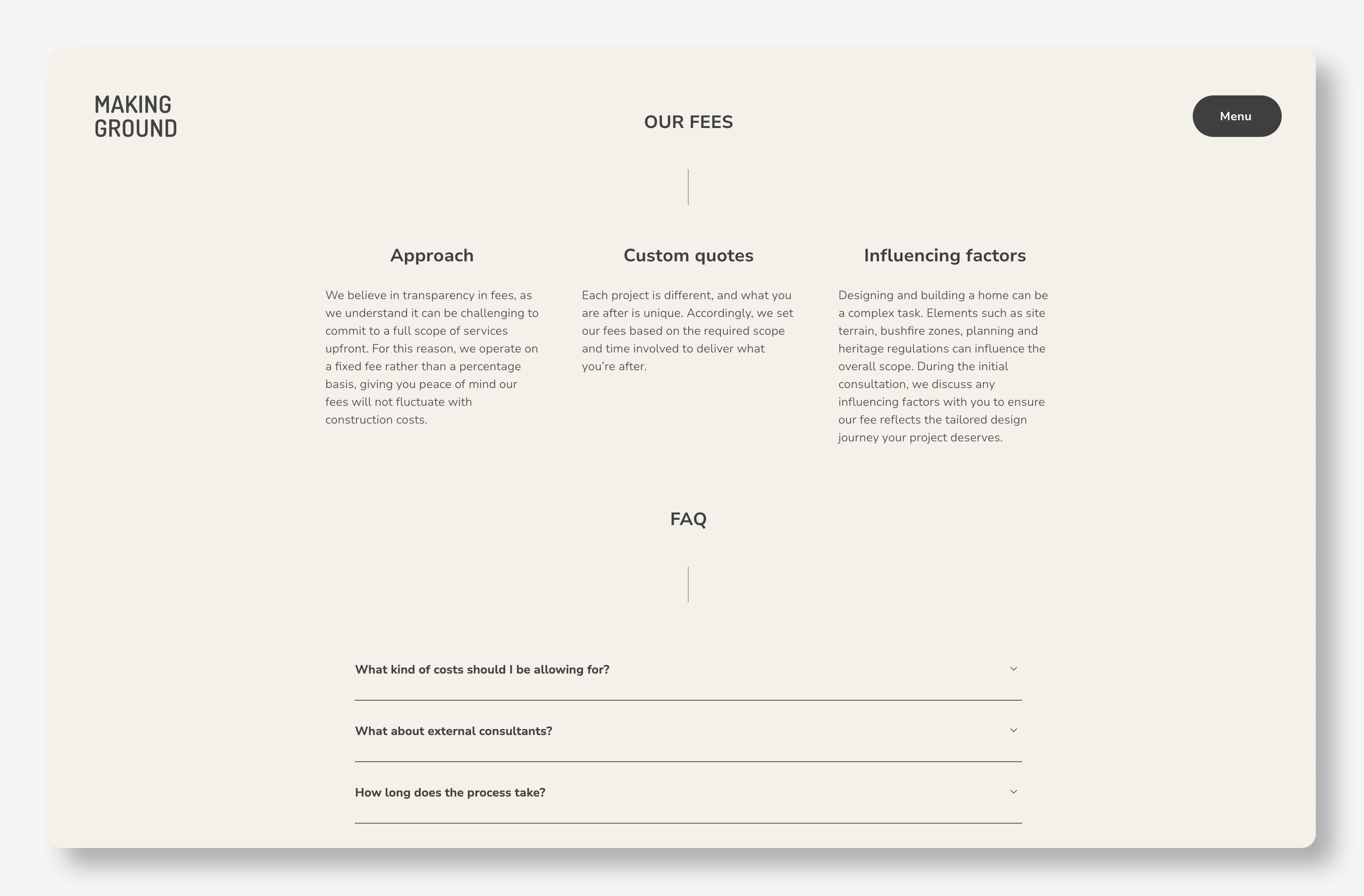
Intuitive elements were incorporated into the website redesign to make service offerings more approachable. Text-heavy content was streamlined and simplified, enhancing the overall experience as users interacted with Making Ground's services.
Based on my past experience as an architect, I made some assumptions about where the major frustrations lied when architectural services were required. This formed my hypothesis, which I later tested to ensure user needs and goals were front of mind.
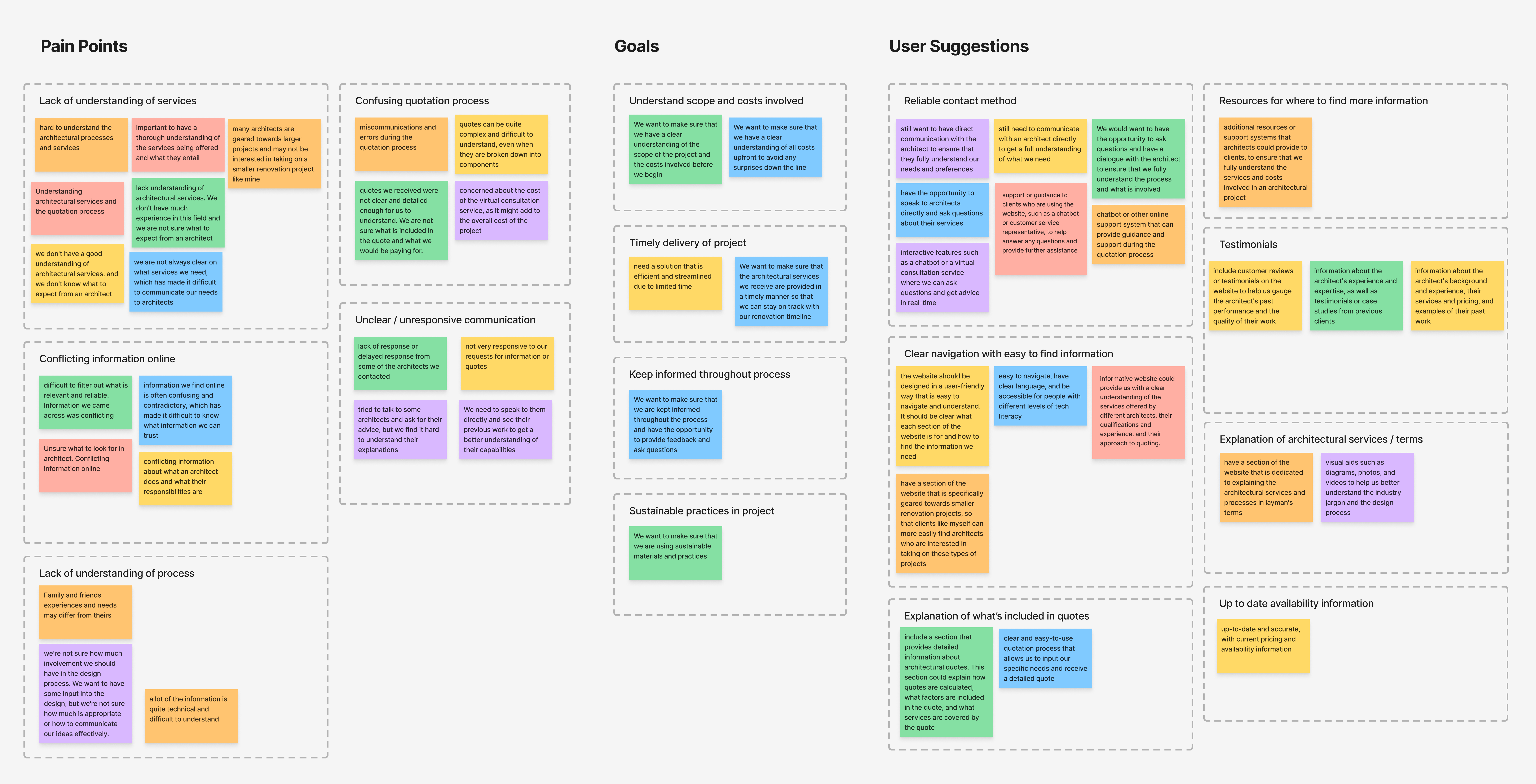
I interviewed a variety of people to understand their decision-making process and their feelings towards engaging an architect. The findings supported my hypotheses and helped me uncover additional pain points, which I grouped into themes.
"Without data, you’re just another person with an opinion."
— W. Edwards Deming

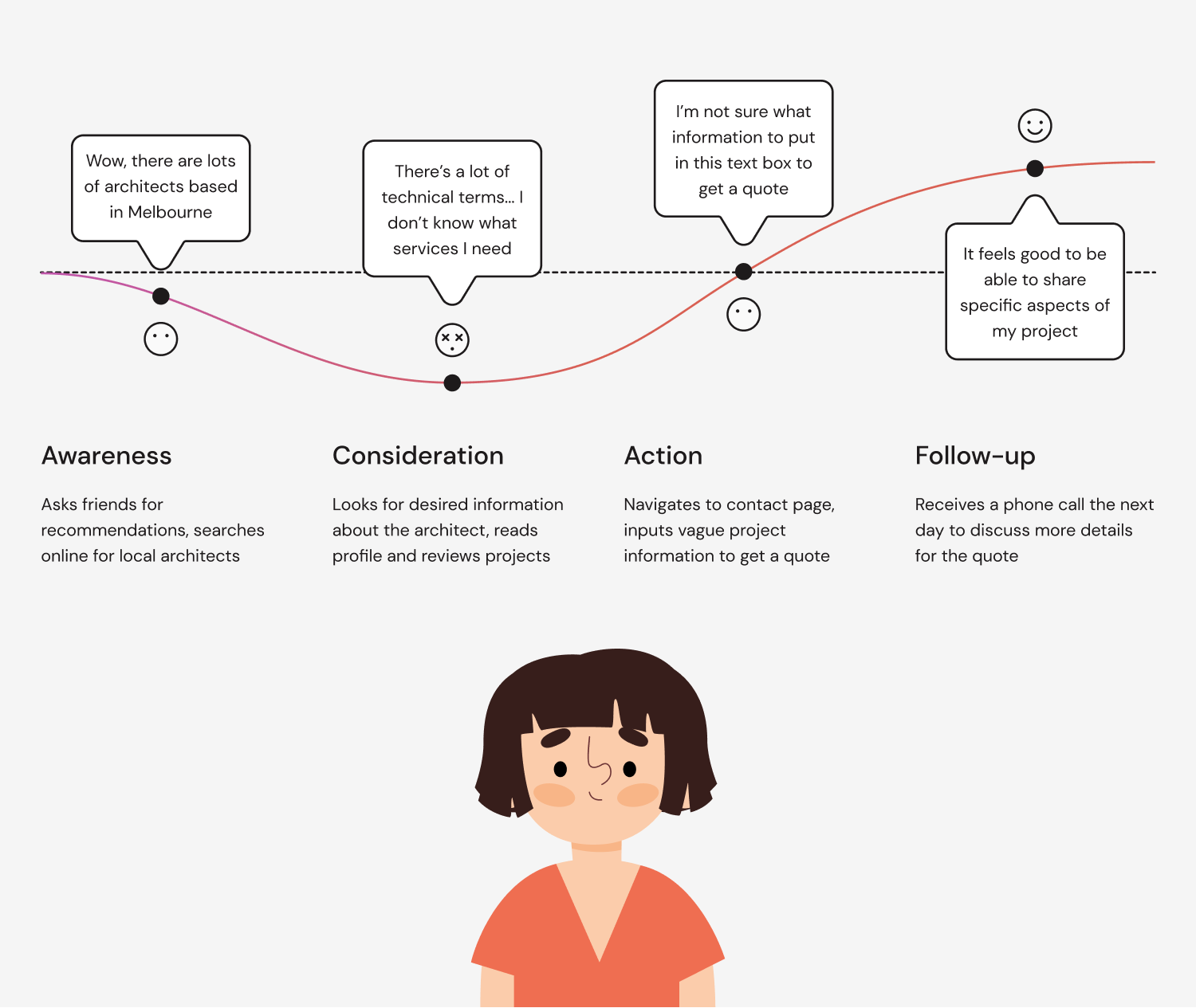
From the data collected, a key user persona with the greatest need emerged — Amanda, a working mum with no prior knowledge of the design and building process. She wanted to minimise her time spent researching architects so she could focus on family and work responsibilities.
I mapped out what Amanda's current journey might look like to identify which areas of the experience needed the most attention.
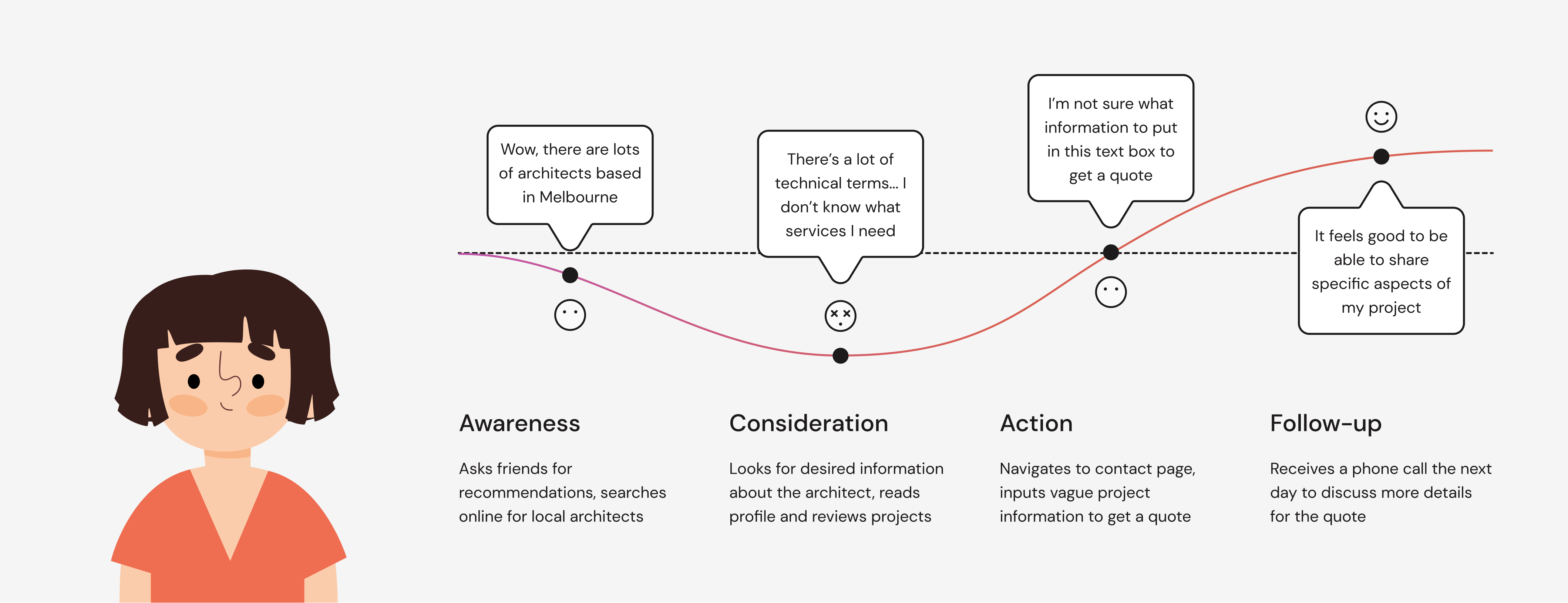
Consideration was defined as the ability to increase users' understanding of architectural services. This was to be achieved by:
Using a guided approach, the aim was to encourage potential clients to provide detailed project information, ultimately driving higher-quality leads.
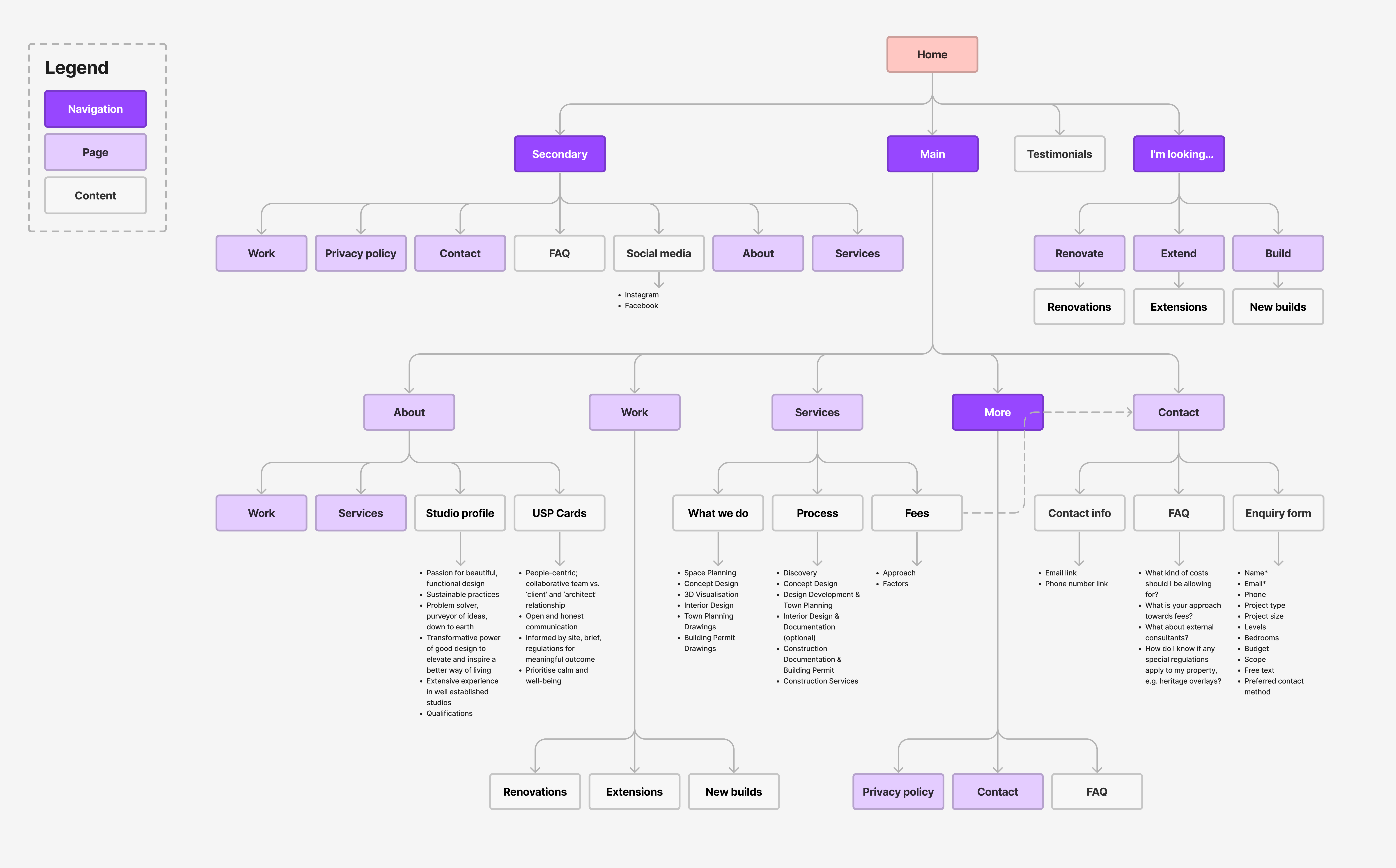
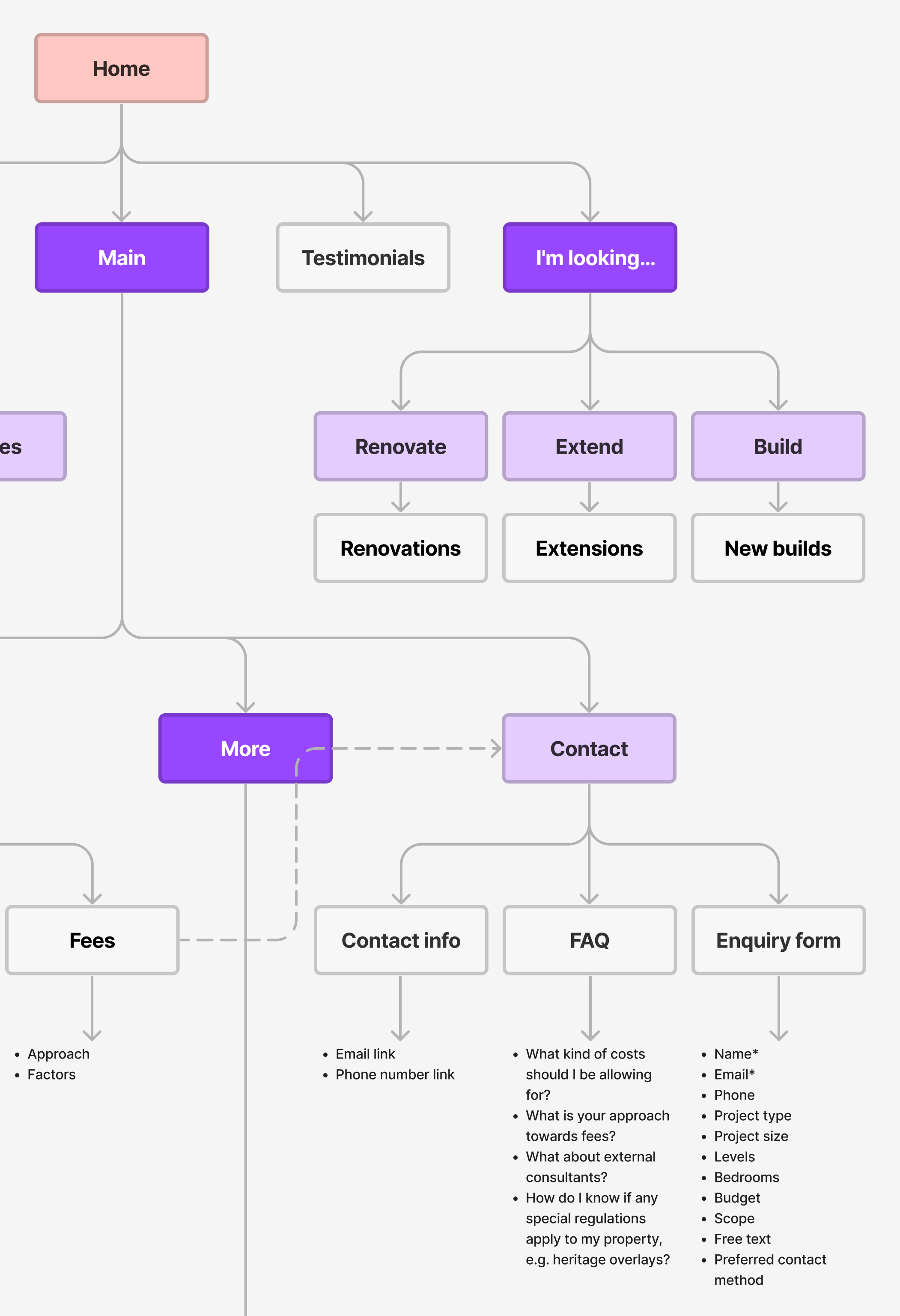
To provide a visual understanding of the website's navigational structure and information architecture, I created a site map detailing actions and content for each page.
I started sketching ideas to explore how information could be displayed in a simplified, more visually appealing way, as well as improved navigation using features like breadcrumbs to guide users through their journey. I researched competitors and insurance websites for inspiration around the contact form's user interface, to learn how they encouraged users to provide personal information without overwhelming them.
Testing wireframes that are too simple often leaves too much to the imagination leading to poor feedback, while overly polished wireframes doesn't leave room for ideas and encourages users to look for flaws. Therefore, I tested mid-fi wireframes with basic copy, ensuring communication was clear and consistent.
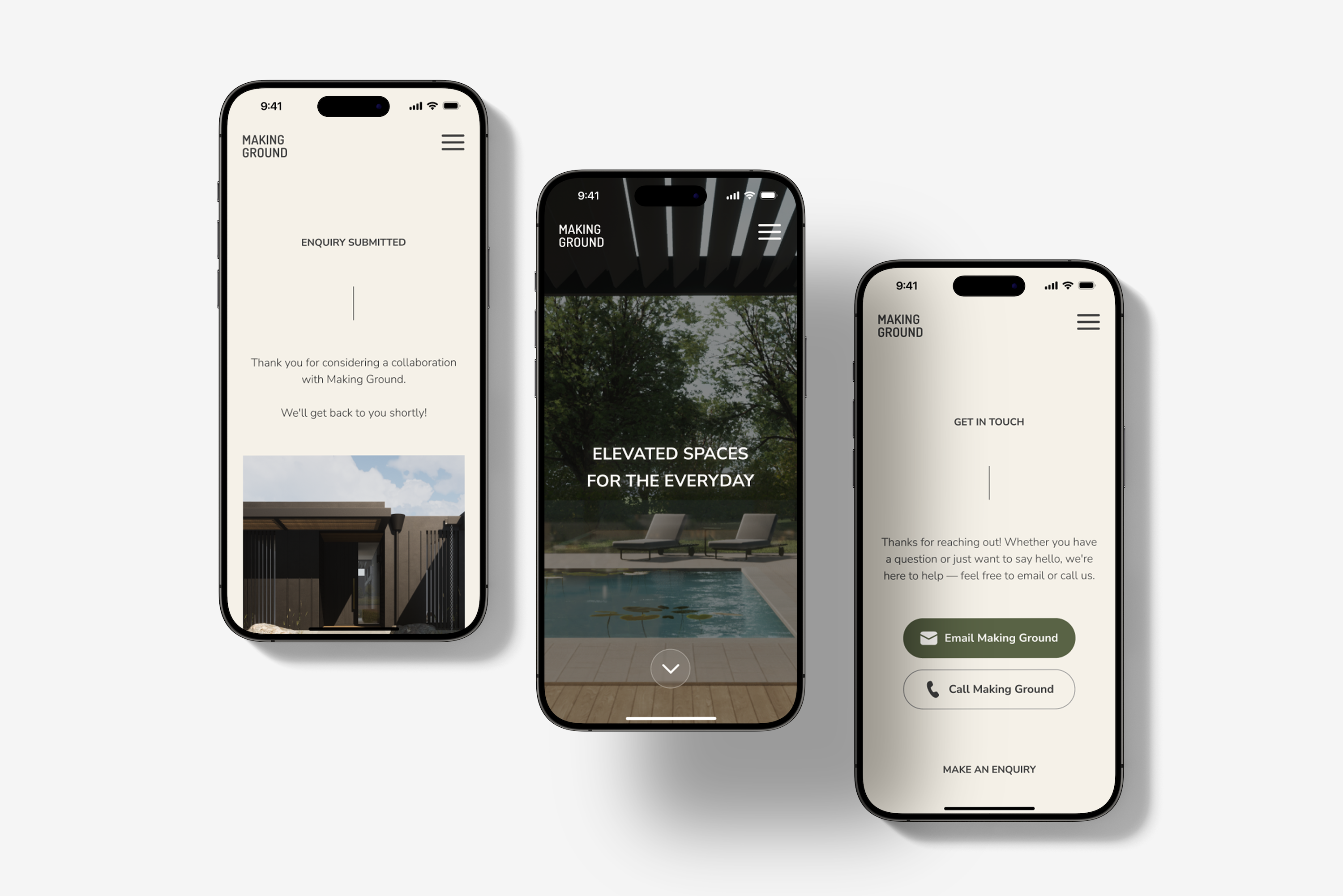
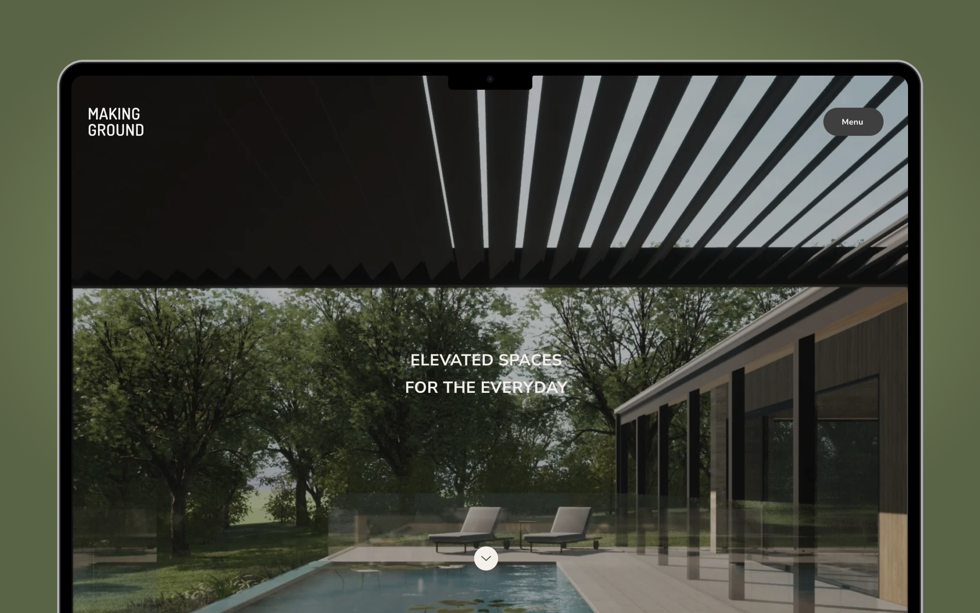
A muted palette set the foundations of the interface that resonated with the brand; elegant, comfortable and emotive. To help Making Ground stand out from the competitive landscape, I incorporated the studio's mission statement on the homepage, overlaid on a captivating image to entice users to keep scrolling.
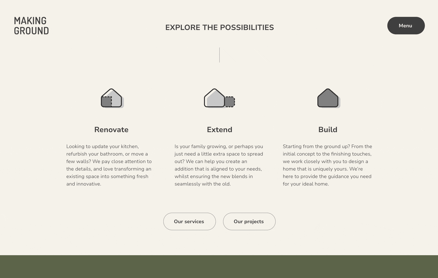
Users are taken immediately to project categories with animated icons suggesting navigational paths, followed by testimonials from past clients to build trust.
A dropdown filter was incorporated on the ‘Projects’ page, allowing users the option to only see the projects they care about, or revert to viewing all projects.
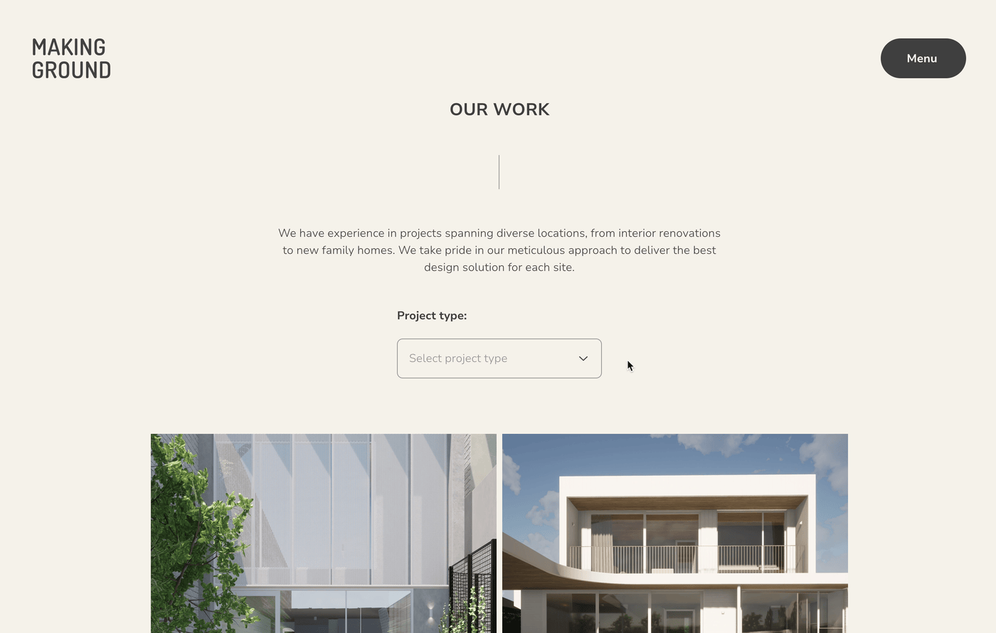
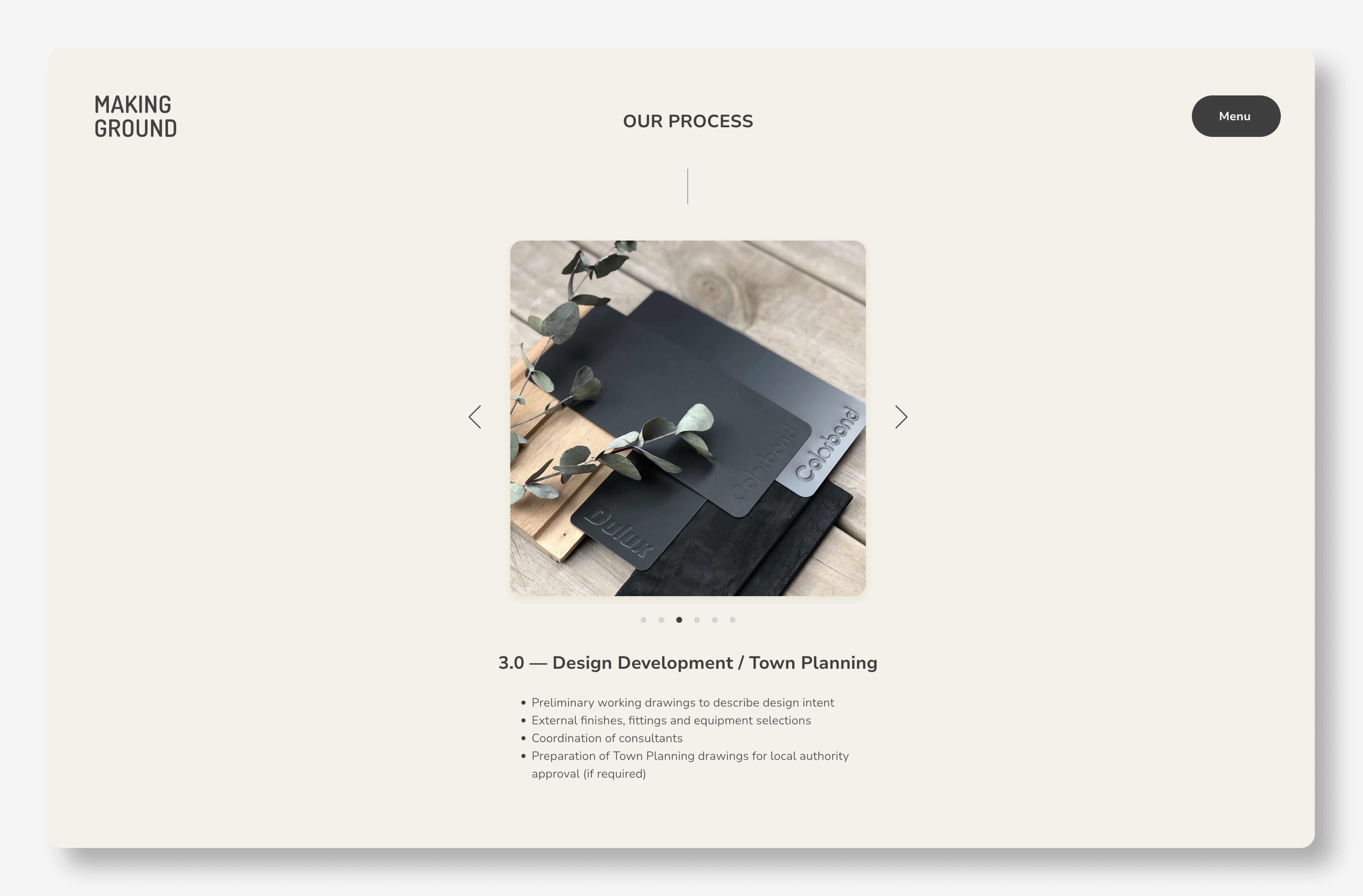
To reduce cognitive load, text-heavy sections were broken up into digestible text blocks and divided across interactive elements using cards, carousels and accordions.
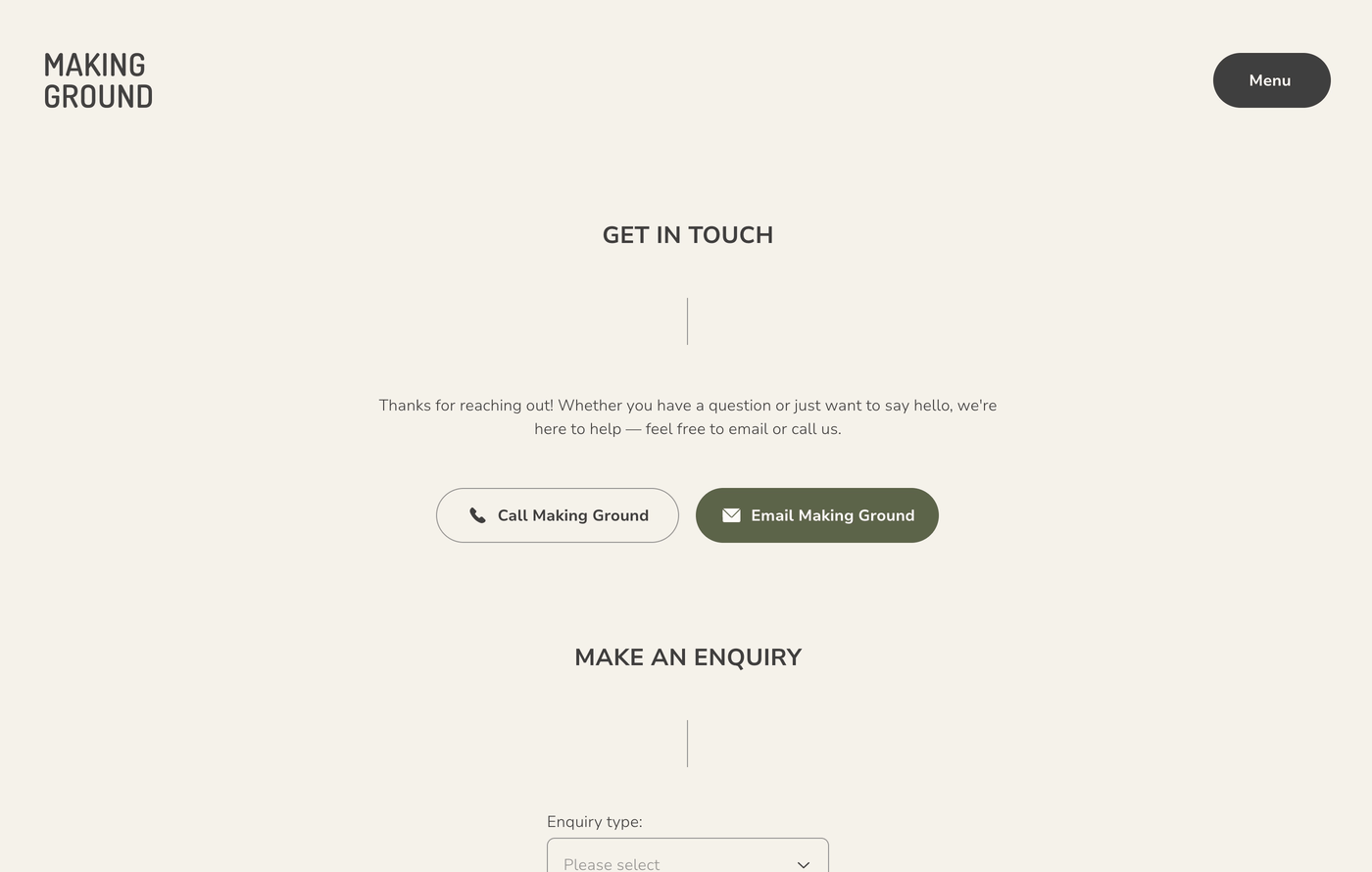
By this point in the journey, users would have learned about Making Ground's process and services, and as a result gravitated towards the ‘Contact’ page. To encourage an enquiry submission, welcoming language is used in conjunction with dropdown selections and pre-filled text fields, so users are guided through each step to make the process as easy as possible.
One month after implementation, analytics showed that the new design had a positive impact on the website’s performance. Bounce rate was decreased by 74%, 43% more pages were visited and site sessions increased by 118%. This aligned with the goals and metrics defined for the project. Increased engagement meant users would explore more content, with the potential of becoming new clients. With longer session times, users were likely to invest more time and attention with improved learning experiences, leading to higher user satisfaction.